Annie’s Homegrown
After General Mill's acquisition of Annie's Homegrown in September 2014, one of Annie's Homegrown's main goals has been to appeal to people outside the usual customer demographic. While so, it was also important to reassure the original loyal customers that the acquisition never compromised the company's pursuit of using organic and all-natural ingredients.
According to the research on the Annie's current consumer demographic, an average consumer of Annie's is likely to be a mother in her 30's with little kid(s). I set the new target demographic to people in late 10's to late 20's, people who grew up eating Annie's products, and fathers (including single dads) who are also trying to raise their kids.
Bernie, Annie's Homegrown's well-known "Rabbit of Approval", is a black and white dutch rabbit. Because Annie's previous brandmark was not scalable to be consistent throughout different applications, the characteristic of a dutch rabbit (black ears and marks on the face) tended to get omitted when the mark is scaled down for digital applications. It was essential to reflect the characteristic of a dutch rabbit on the mark, and keep the mark consistent to honor the brand's original history and integrity — especially when the integrity has been in question since the acquisition.


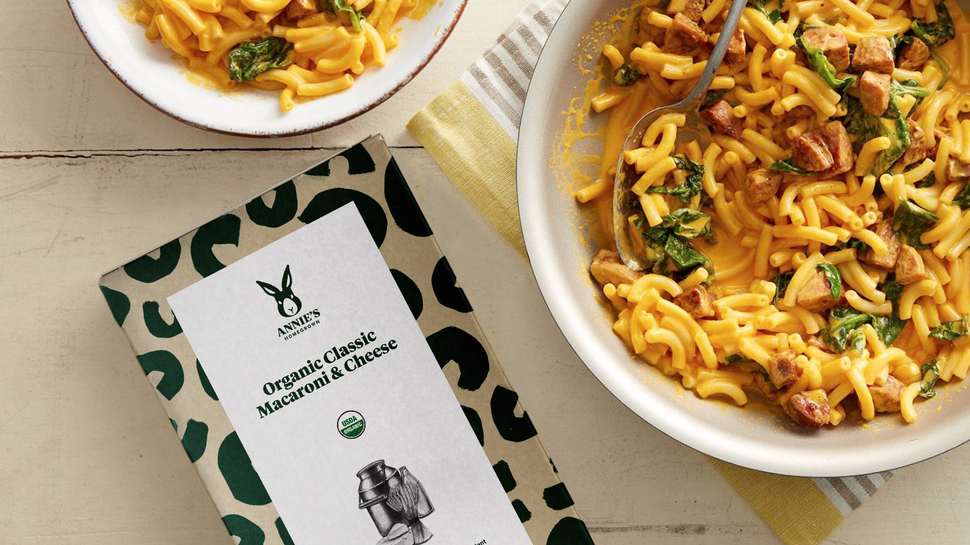
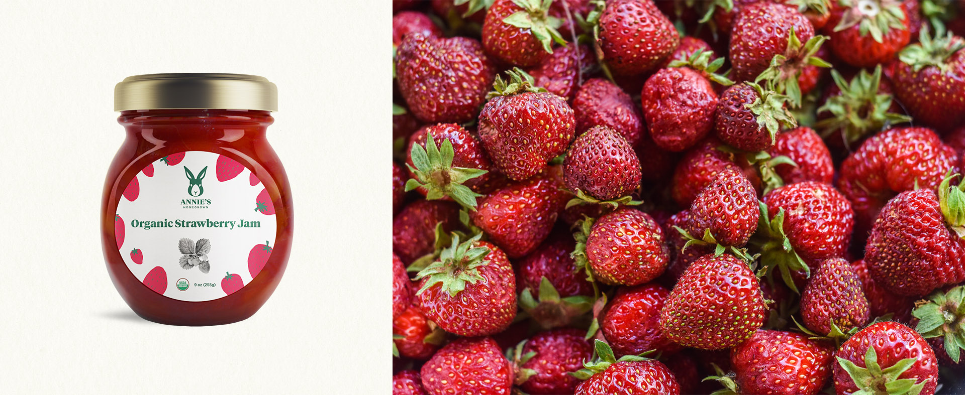
I established a visual system utilizing both detailed pencil illustration of raw ingredients and playful, natural, raw, and a bit childish illustration of close-to-final products and other miscellaneous ingredients. The playful / childish illustration is used for different applications such as package design, point of sale, merchandises, etc. Illustrations by yours truly.

The primary color (PMS 3435C) would be used to indicate a product is organic, and the secondary color (PMS 1505C) would be used to indicate a product is not 100% organic.
In addition to being an advocate of sustainable farming, Annie's also has been an advocate of sustainable packaging. The new packaging system would require less amount of ink, thus making the packaging more eco-friendly.


An amalgam of playful/childish illustration would be used for other elements such as but not limited to distribution trucks, promotional items, and point of purchase.


With the new target demographic in mind, I developed the website's new content strategy that would appeal to the new target demographic. I designed a fully responsive experience for the website that integrates an acute attention to detail with an intuitive user experience.


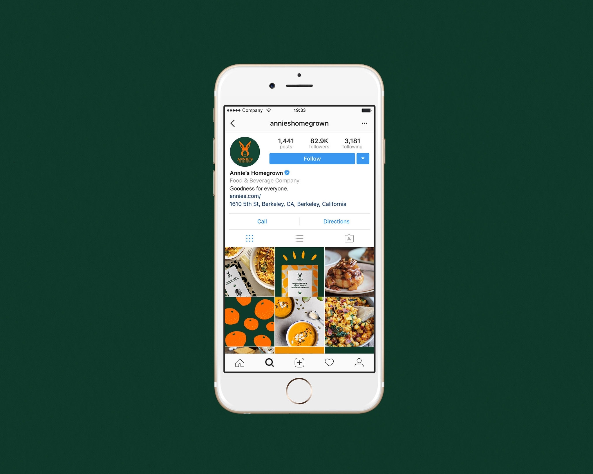
I also developed a new social media strategy that would demonstrate the use of photography, illustration, and color palette on Annie's social medias to make the feeds look on-brand.