Print & Packaging
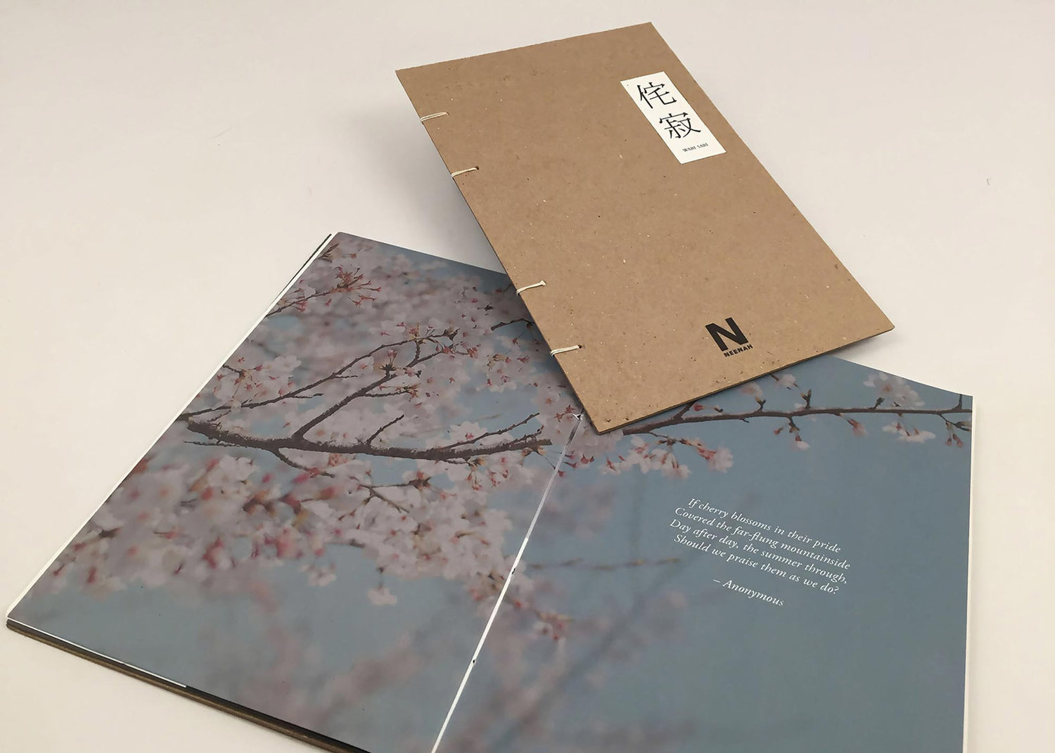
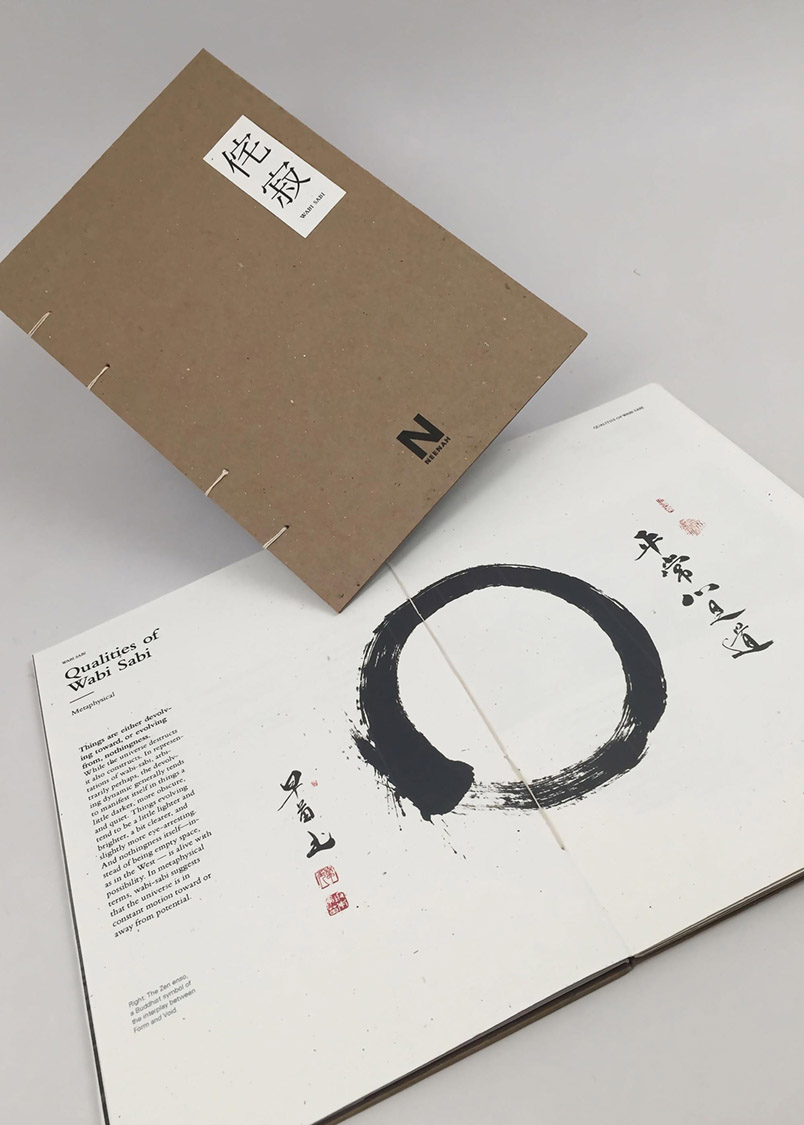
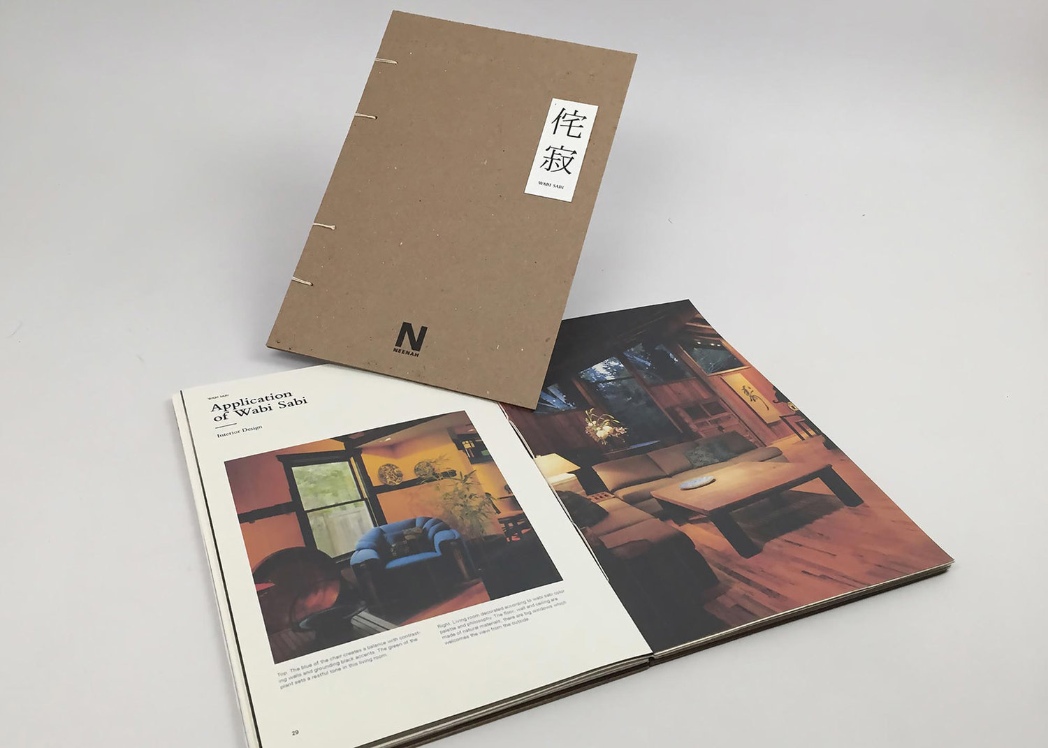
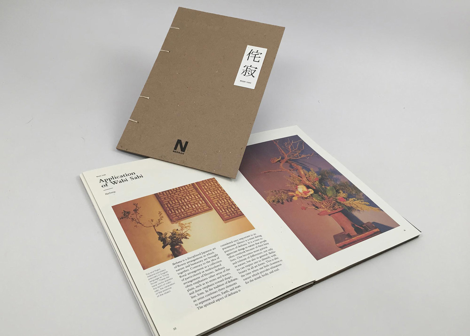
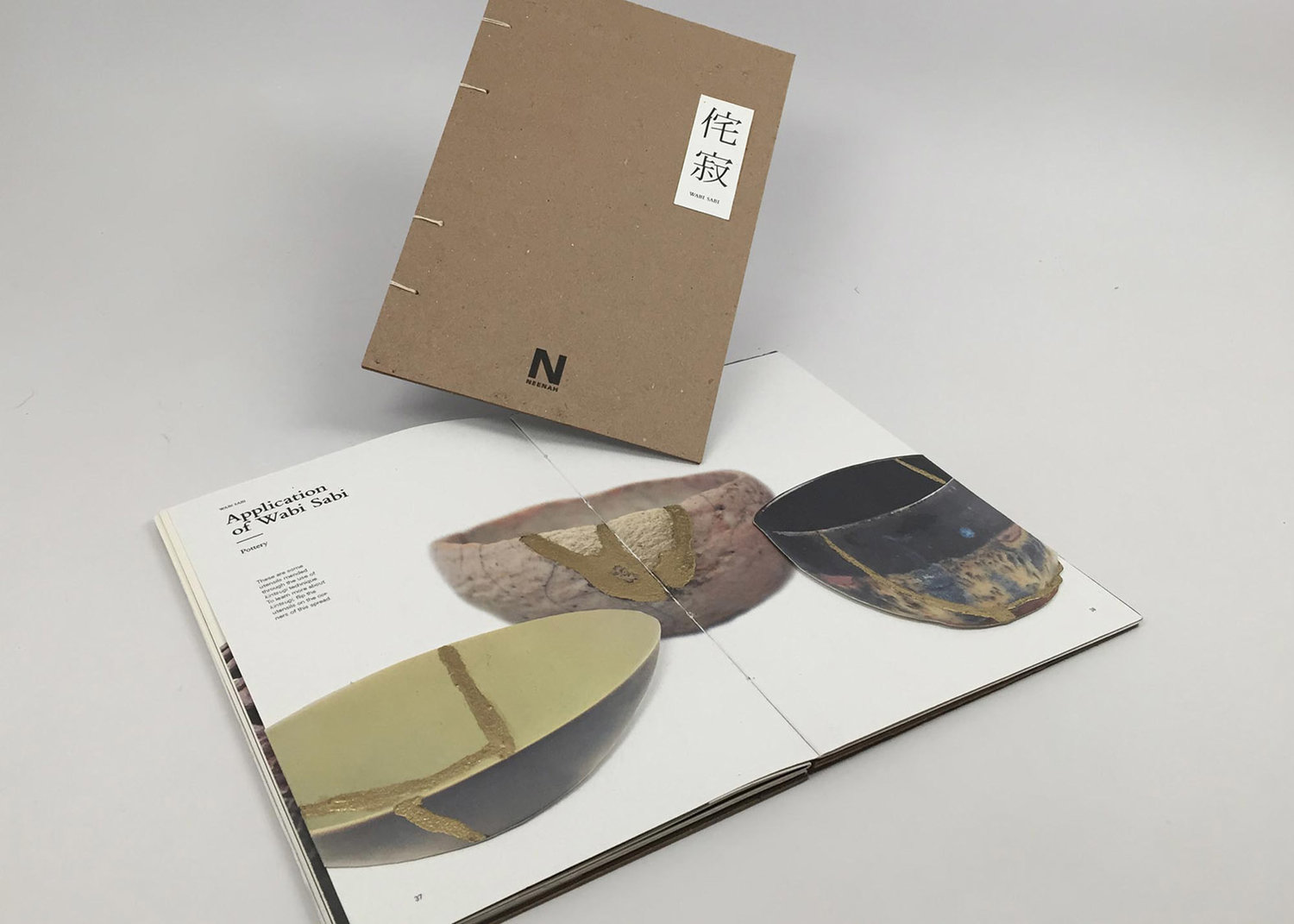
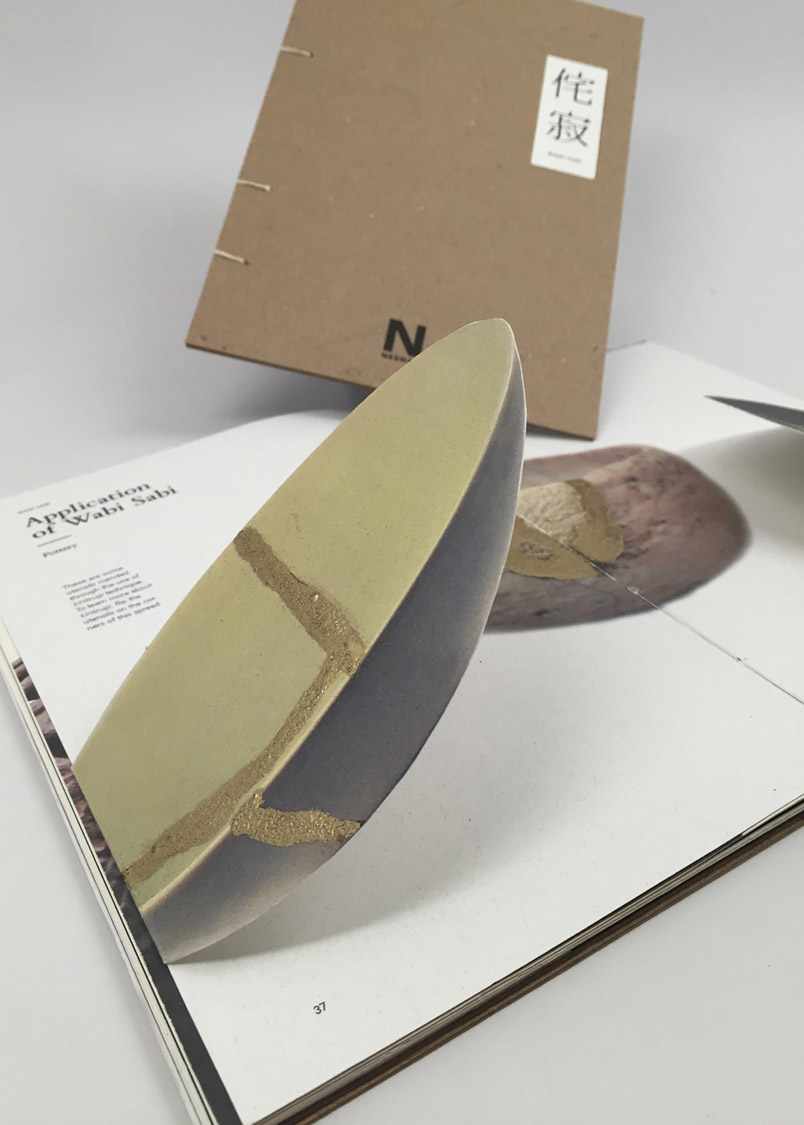
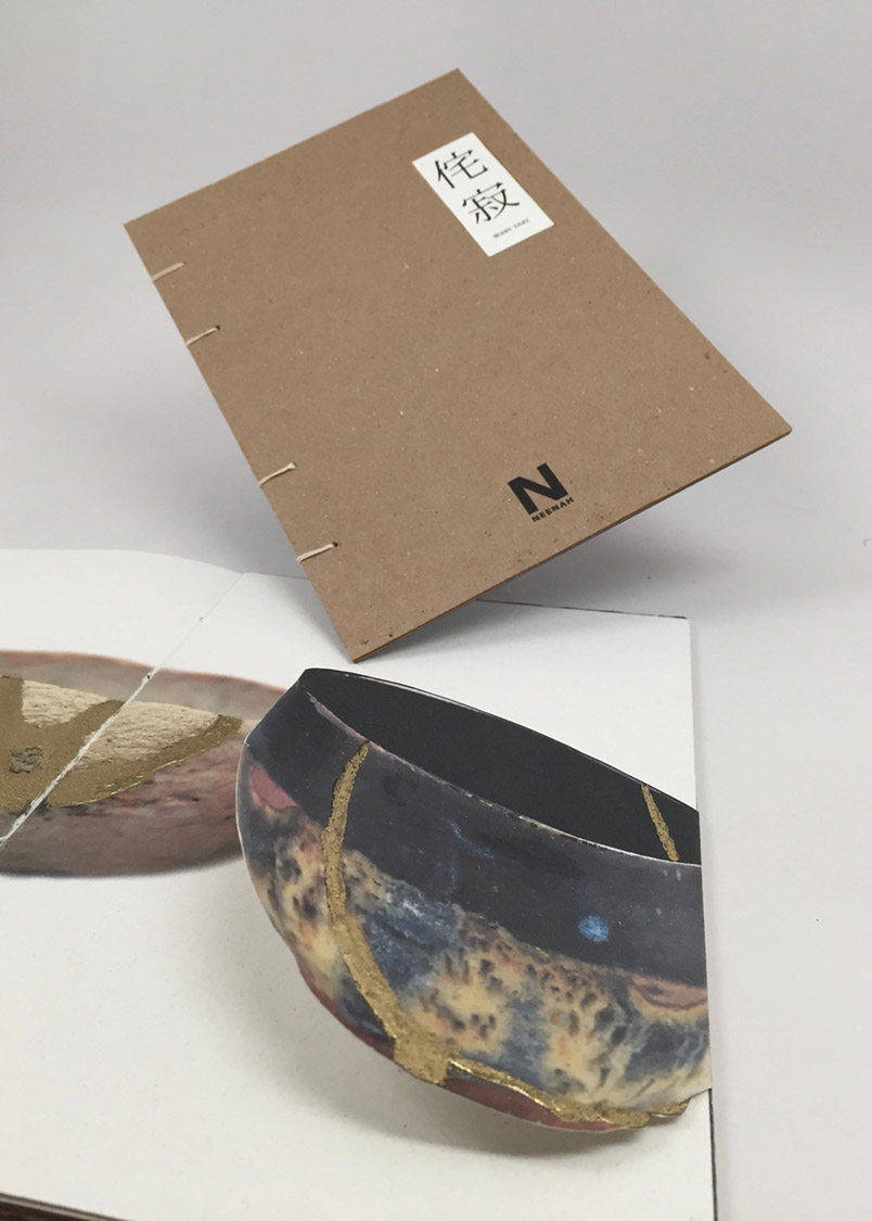
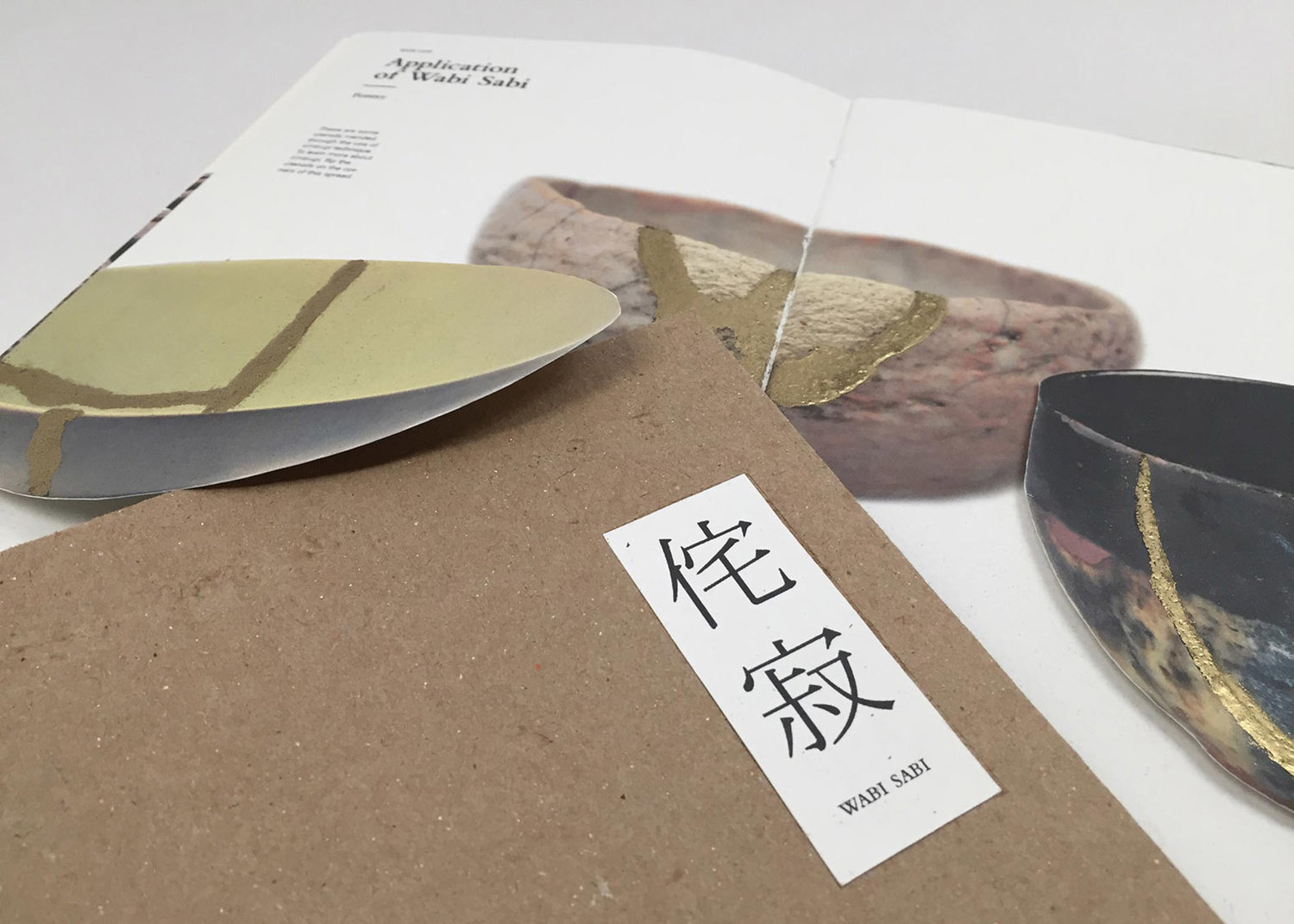
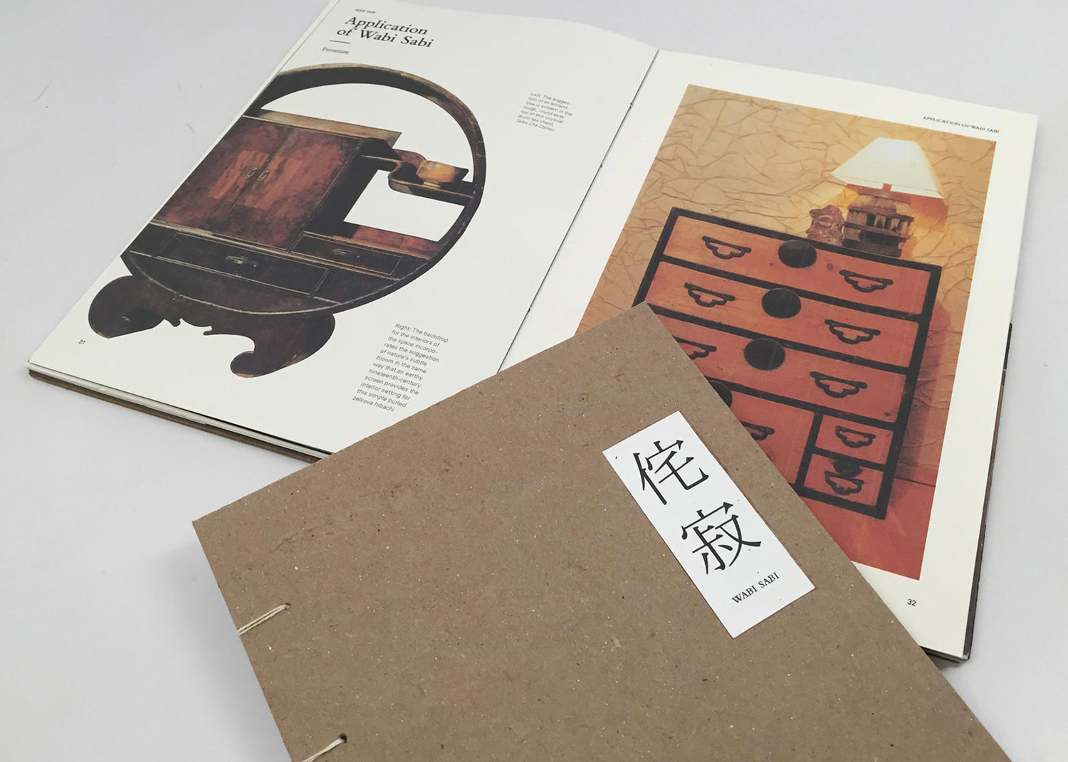
Wabi-Sabi Paper Promotional Book
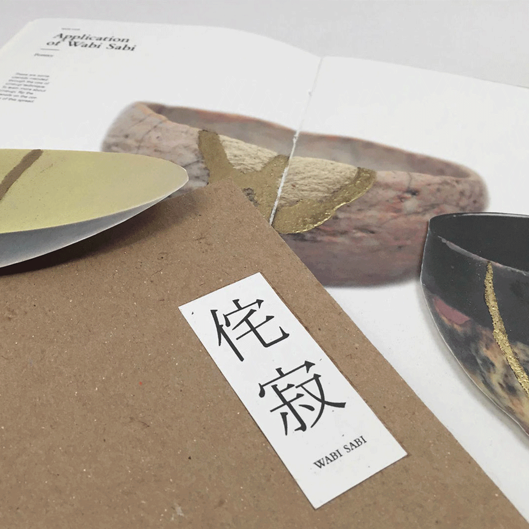
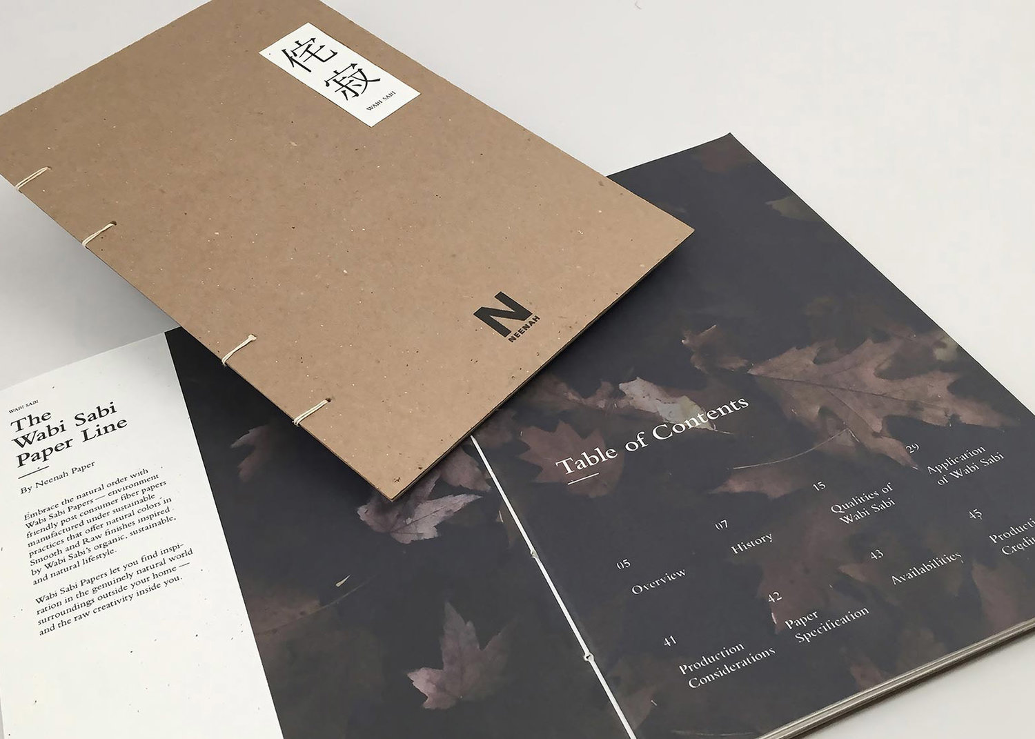
A limited-edition Neenah paper promotional book based on wabi-sabi, Japanese philosophy, and aesthetic centered on the acceptance and celebration of imperfection, incompleteness, and transience of life. The book showcases the different types of texture, weight, and color of paper that is offered, as well as the philosophy and the application of wabi-sabi.
I strived to stay true to the core value of wabi-sabi, which is the symbiotic relationship with the imperfect, incomplete, transient yet beautiful nature.
Design-wise, I left plenty of negative space when designing each spread so that the viewer would feel comfortable and zen when reading each spread.
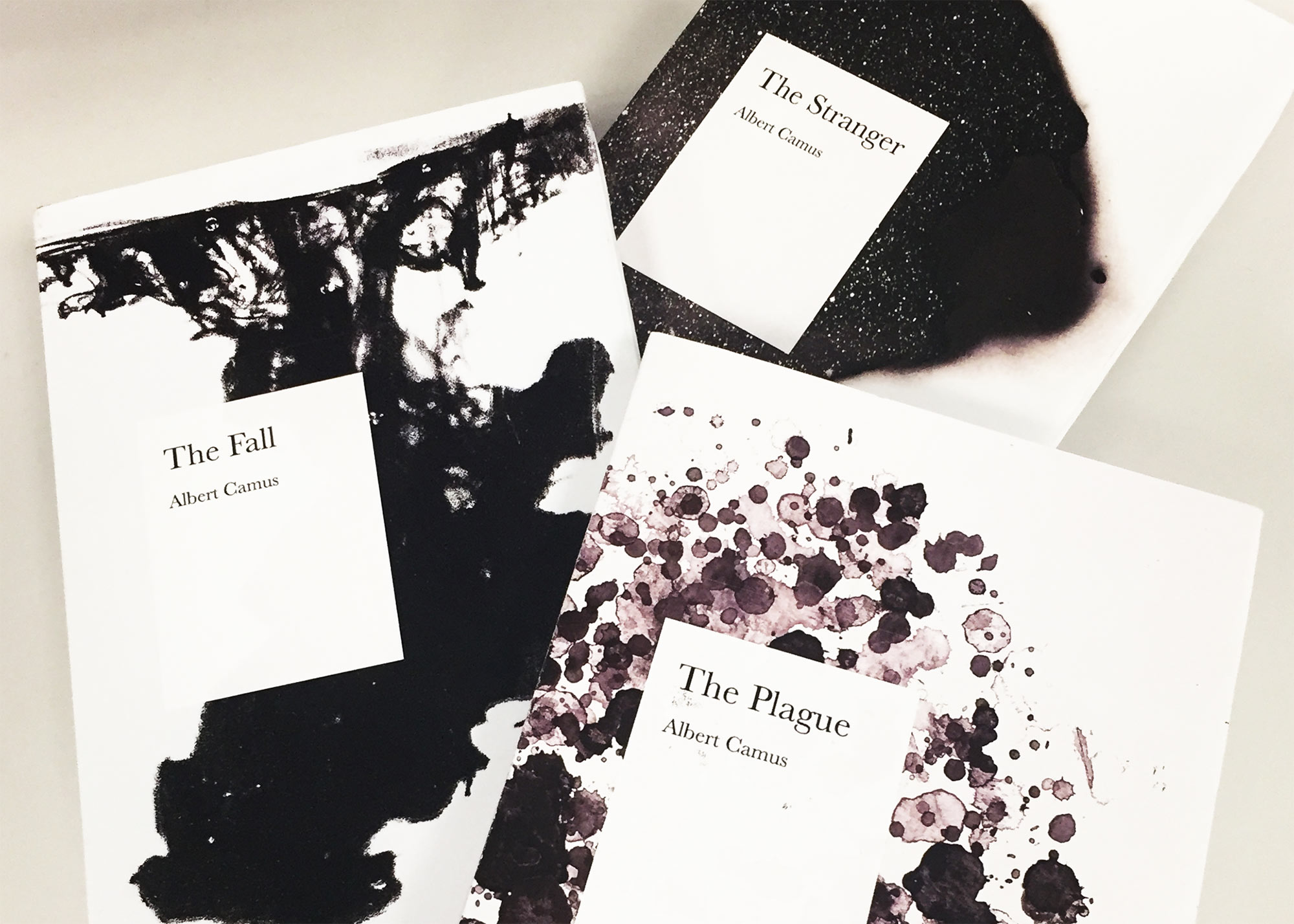
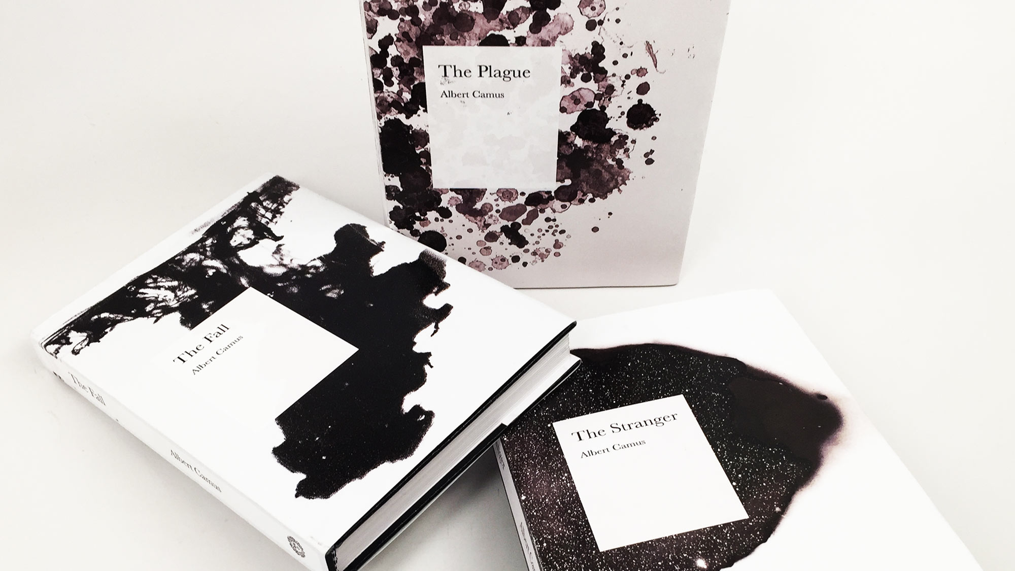
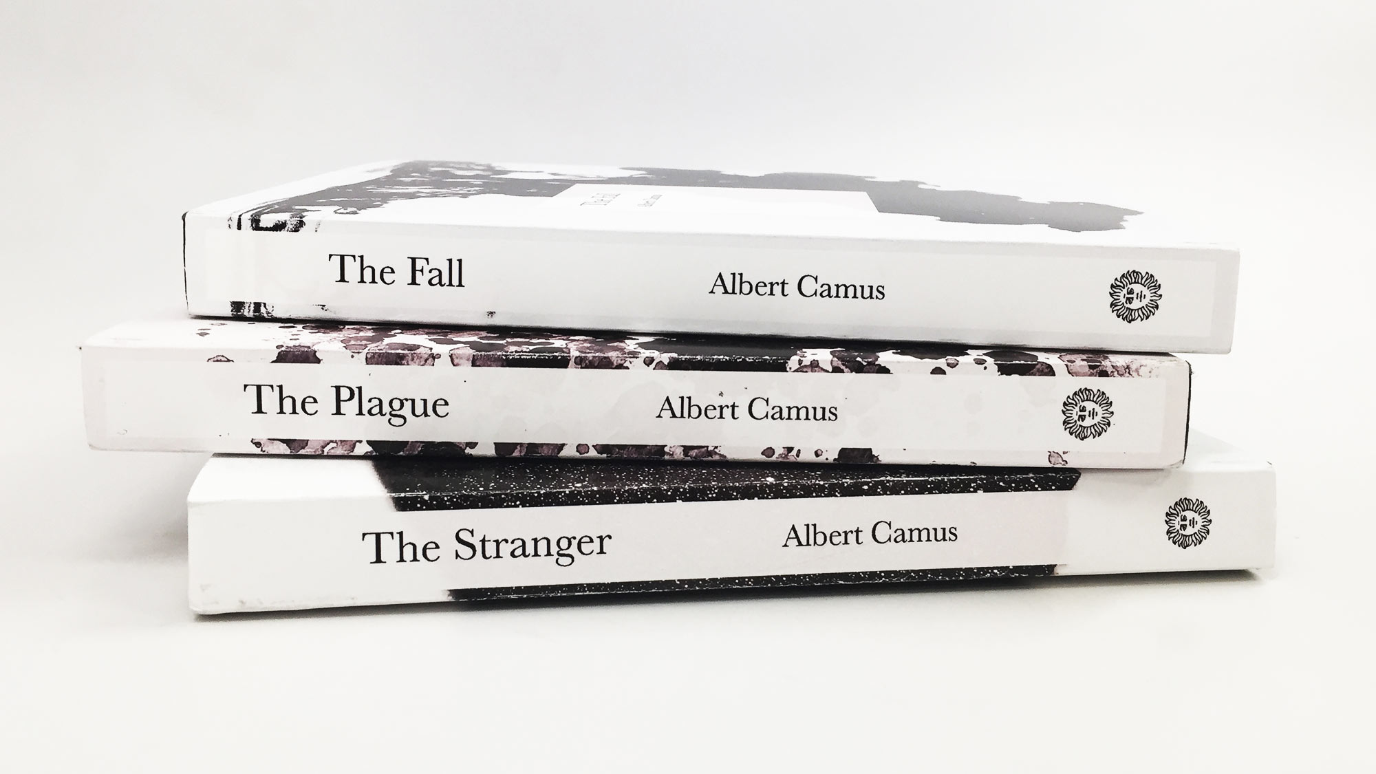
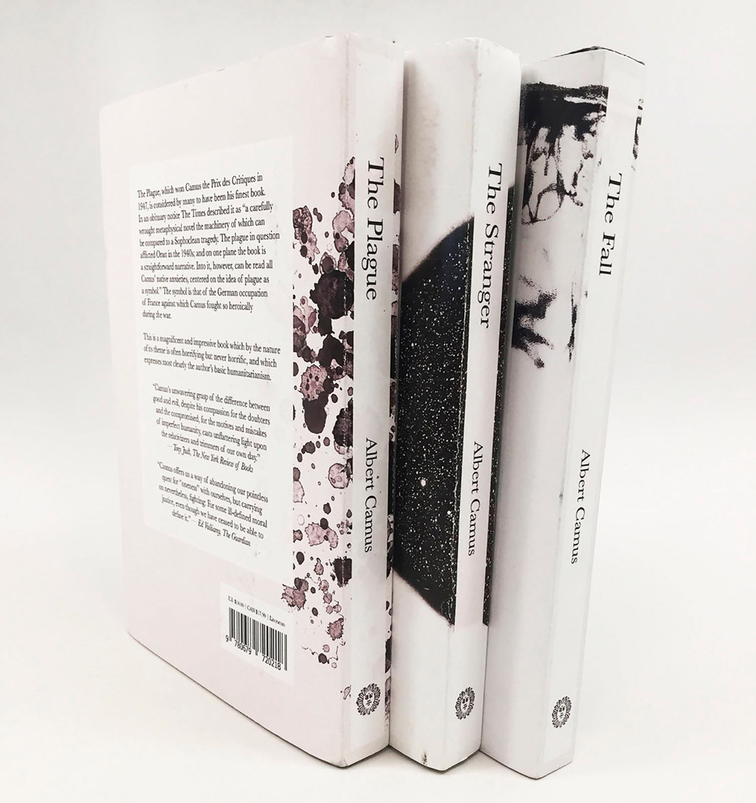
Albert Camus Trilogy Book Covers
The book cover design of three books by Albert Camus — The Stranger, The Plague, and The Fall. Not only each book cover had to communicate its story, themes, and ideas, but all three book covers also had to work as a cohesive visual system.
For The Stranger, Meursault killed the Arab “because of the sun”. So I included the imagery of a sheet of paper burnt by a ray of sunlight created using a magnifying glass. I was also inspired by the phrase "to be burnt out" as I believe it demonstrates Meursault’s state perfectly. The quote “…For the first time, in that night alive with signs and stars, I opened myself to the gentle indifference of the world...” was the reasoning for including galaxy in the background. For The Plague, not only the disease itself was the source of inspiration (how bacteria grow on a petri dish in such a way; and vomiting blood is one of the main symptoms of the disease), but also the state of confinement due to the quarantine, and how the people of Oran came together to fight the plague. And The Fall, the incident where the woman jumps off the bridge was the main inspiration, as Jean-Baptiste Clamence's perfect reputation was ruined by it, like a drop of black ink ruining a cup of clean water.
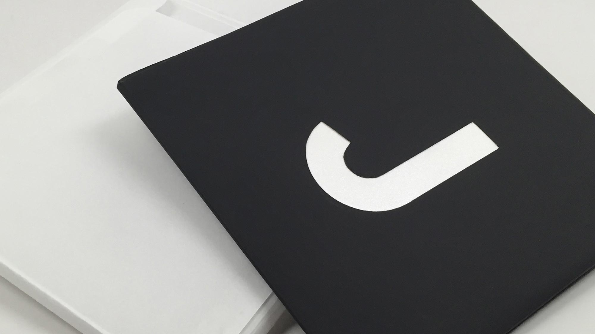
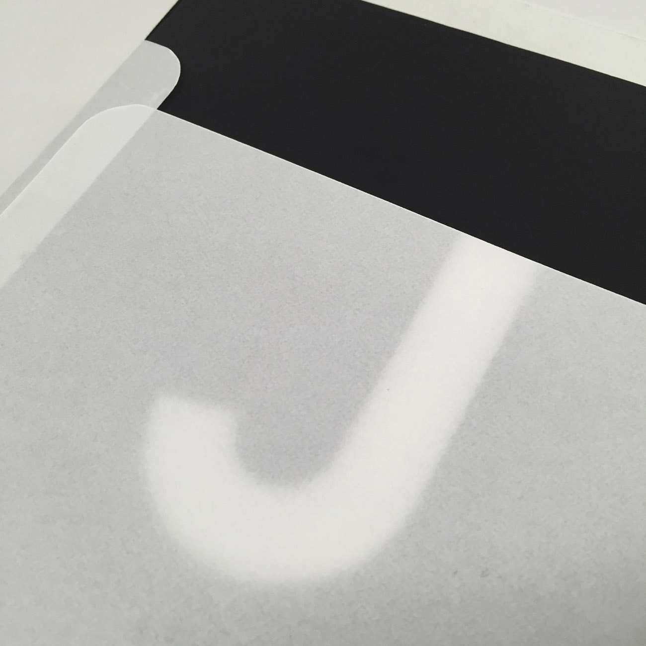
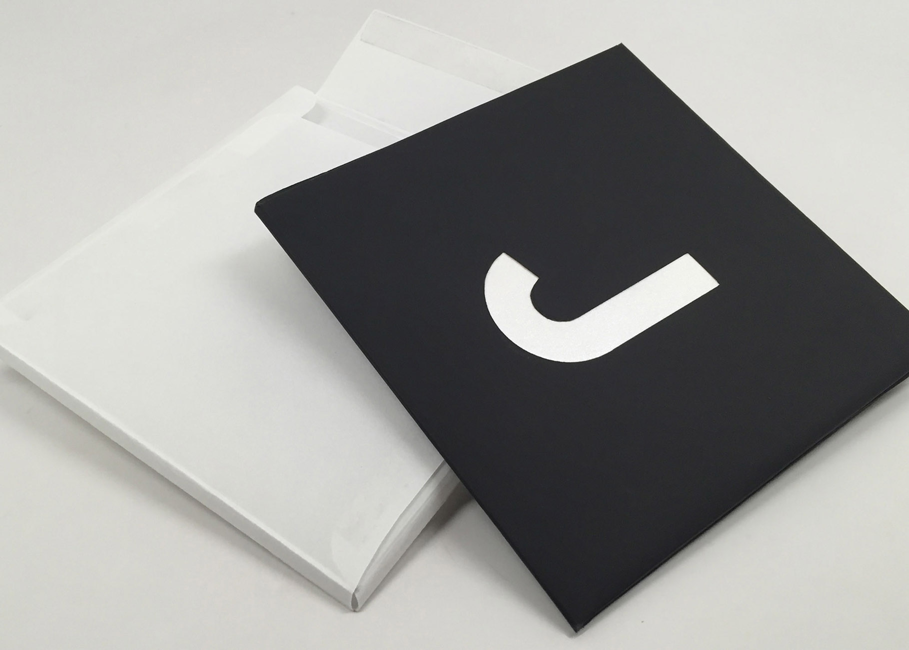
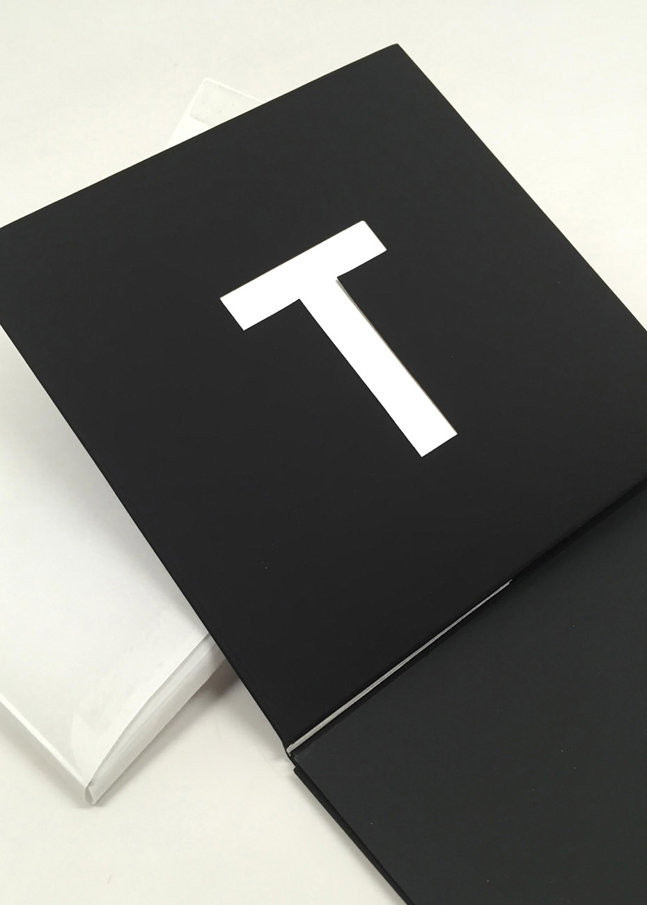
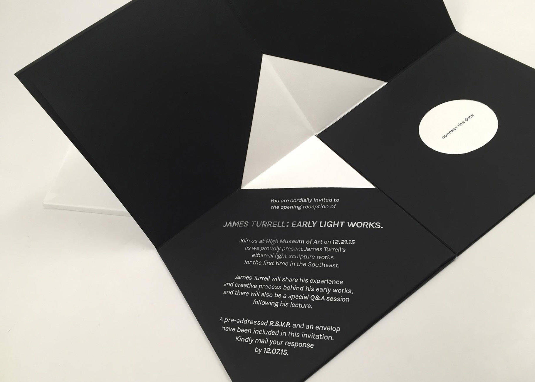
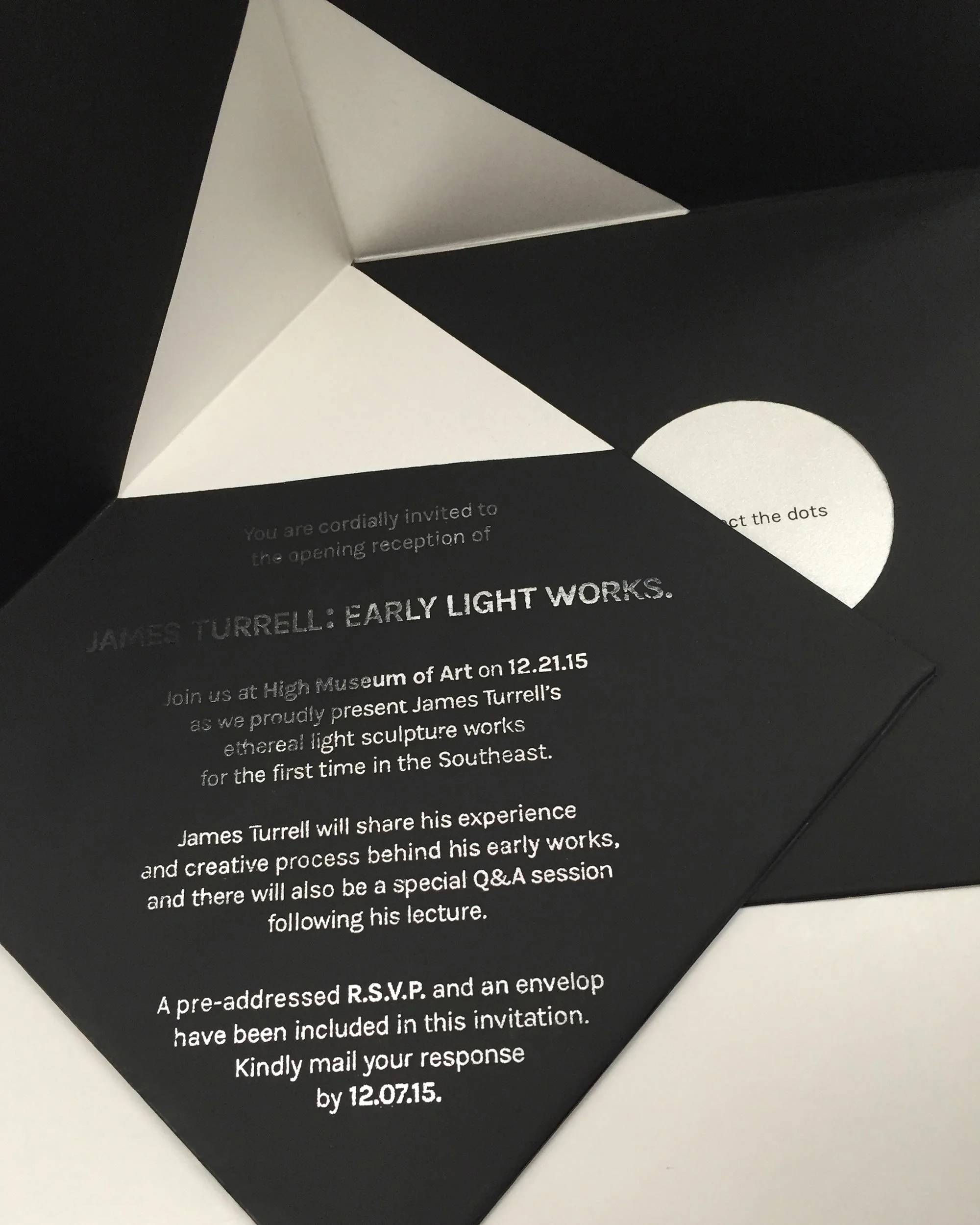
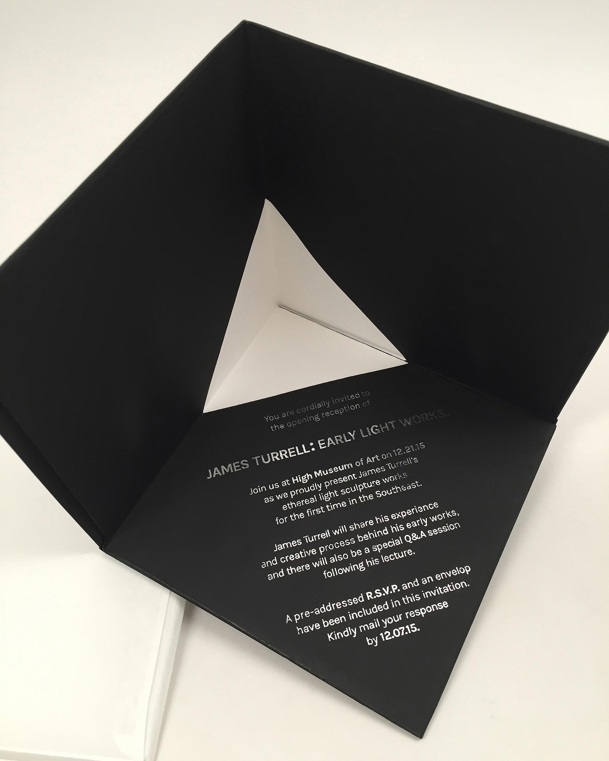
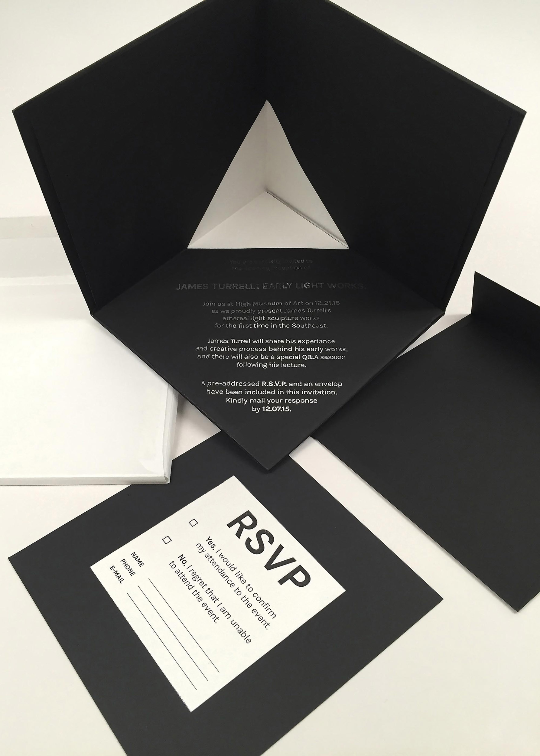
James Turrell Exhibition Opening Reception Invitation Card
Invitation card design for a fictional event — an opening reception of James Turrell: Early Light Works at the High Museum of Art in Atlanta, GA. The form was inspired by Turrell's early light sculptural technique — he projects light, which has no dimension, into a space to create a seemingly three-dimensional illusion. Designed the card in a way that the receiver can create space by connecting two panels of the card together, starting from a flat card to a three-dimensional illusion.


An example of James Turrell's Early Light Work.
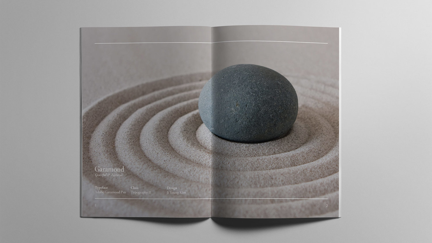
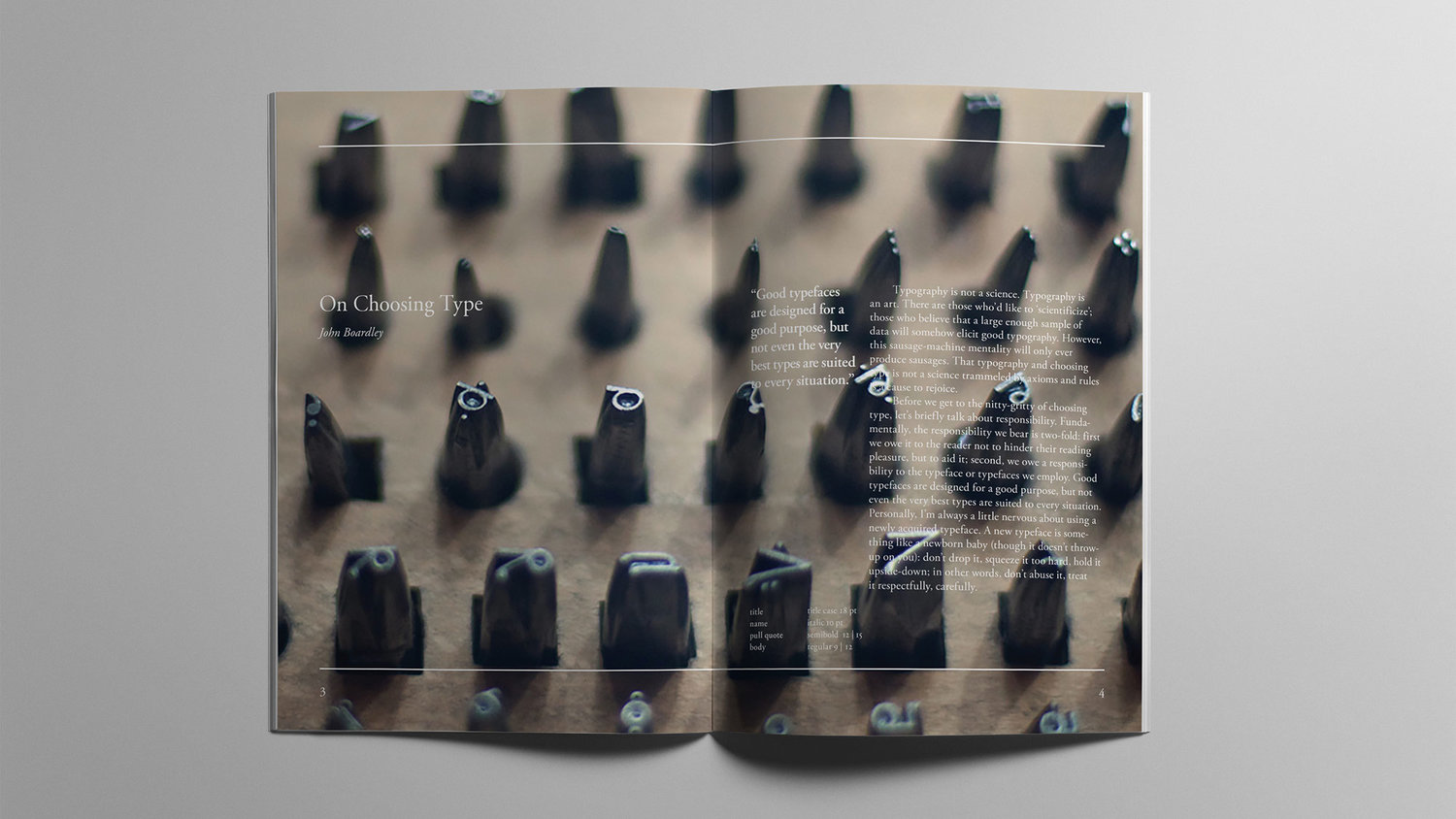
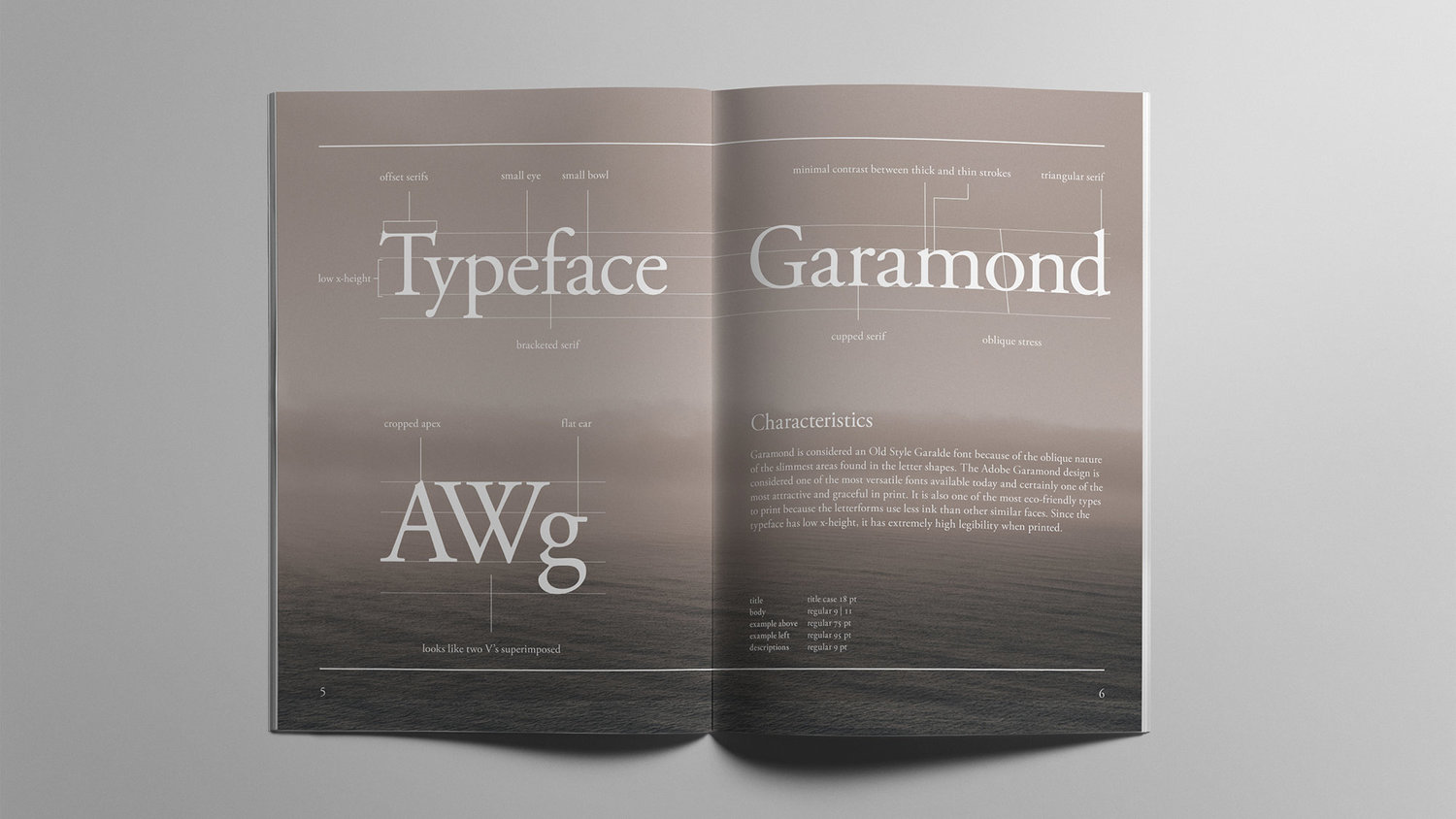
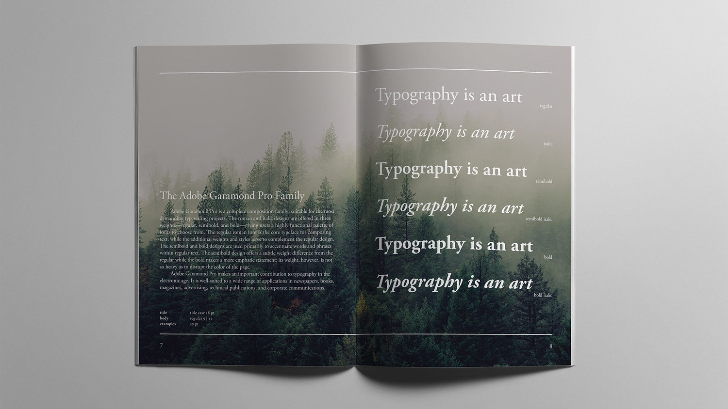
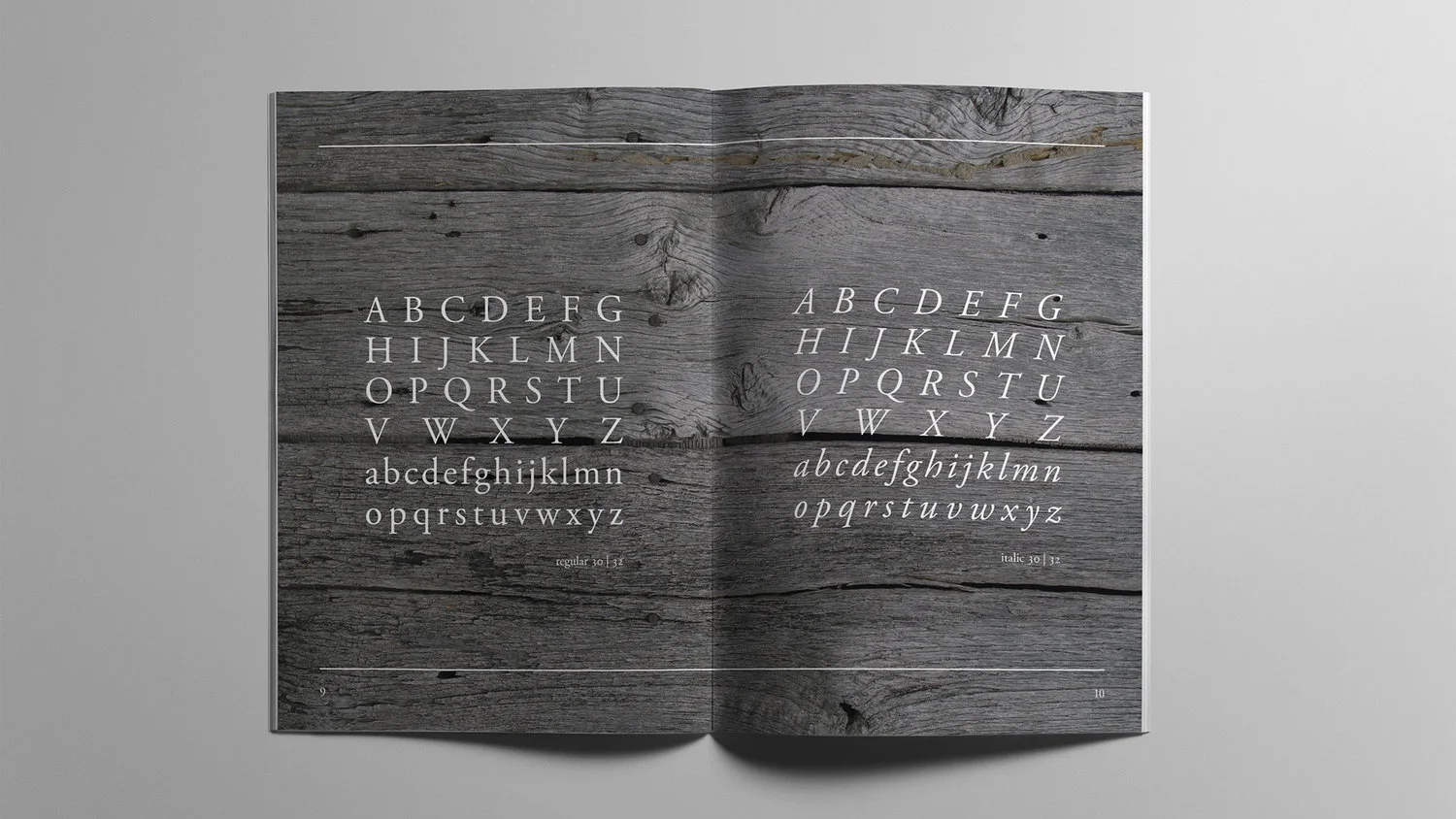
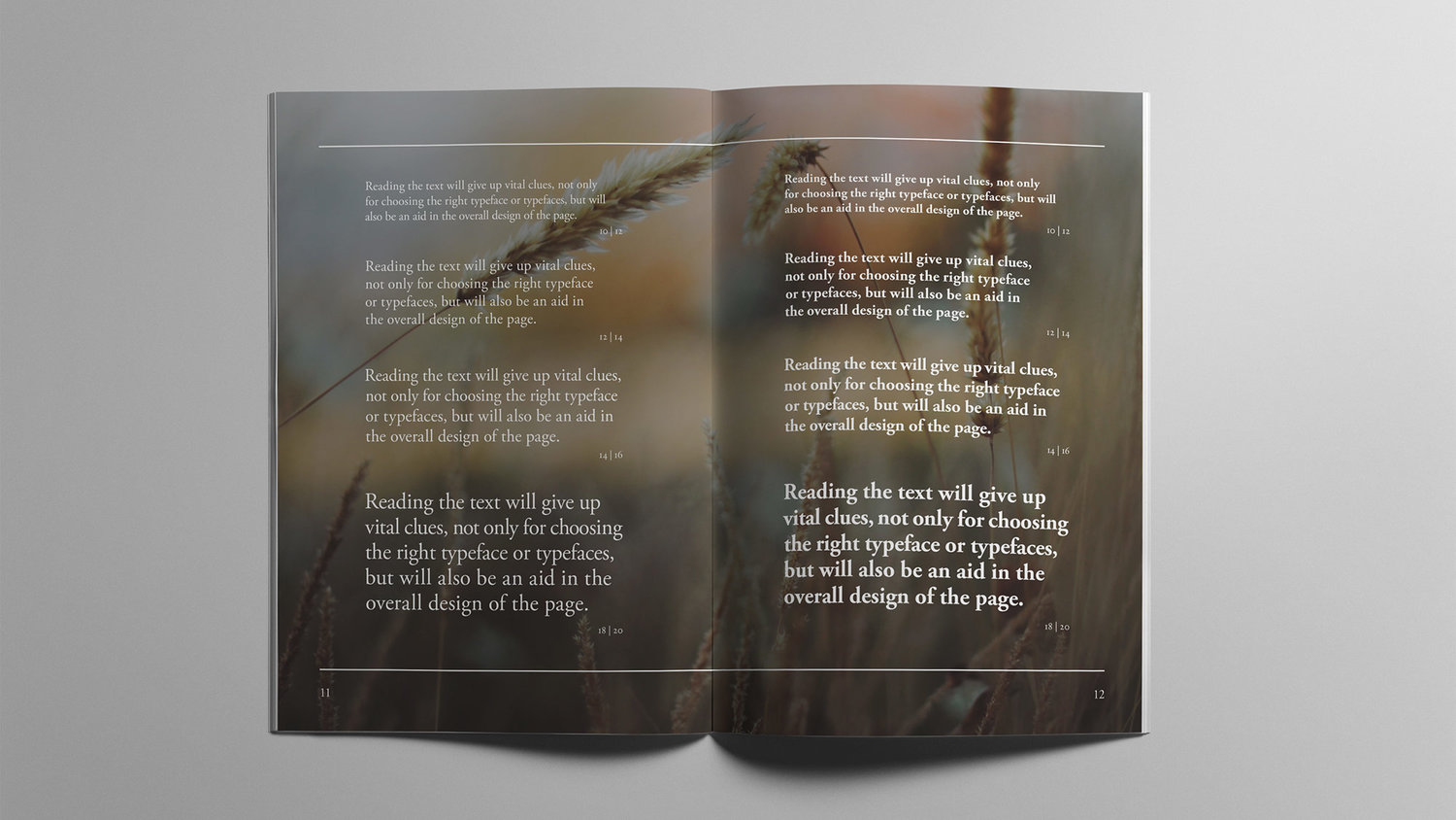
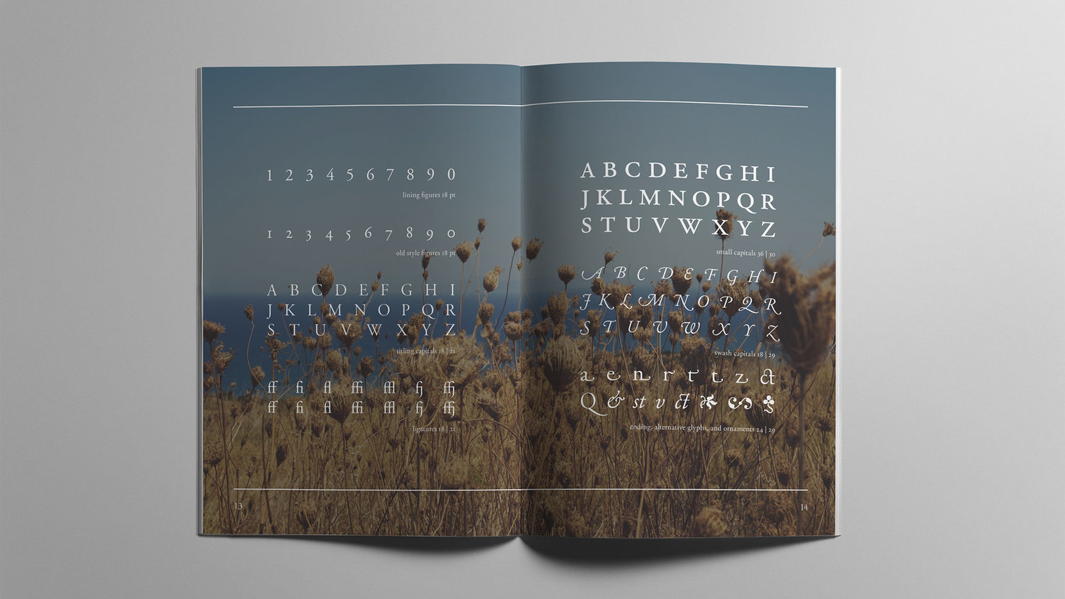
Garamond Type Specimen Book
Original research and production of a Garamond type specimen book. The given typeface had to be incorporated into each page. After doing some research on the history and the usage of Garamond, I decided to focus on the typeface's humanistic, natural, ancient, and humble characteristics.
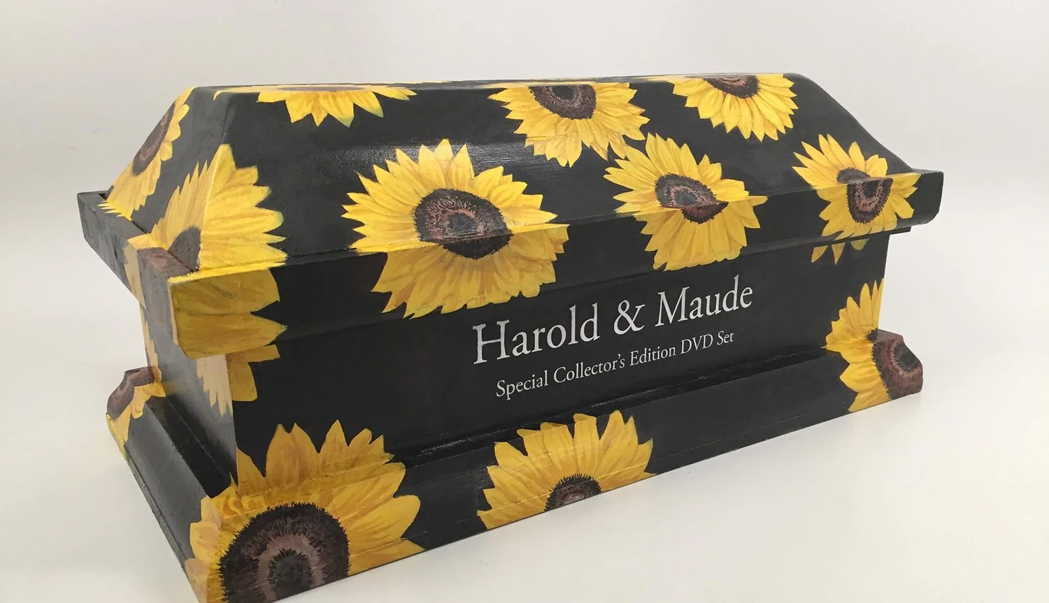
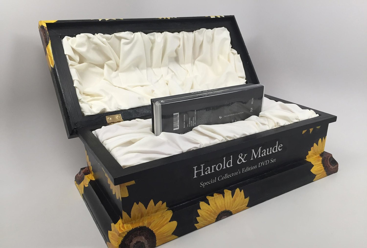
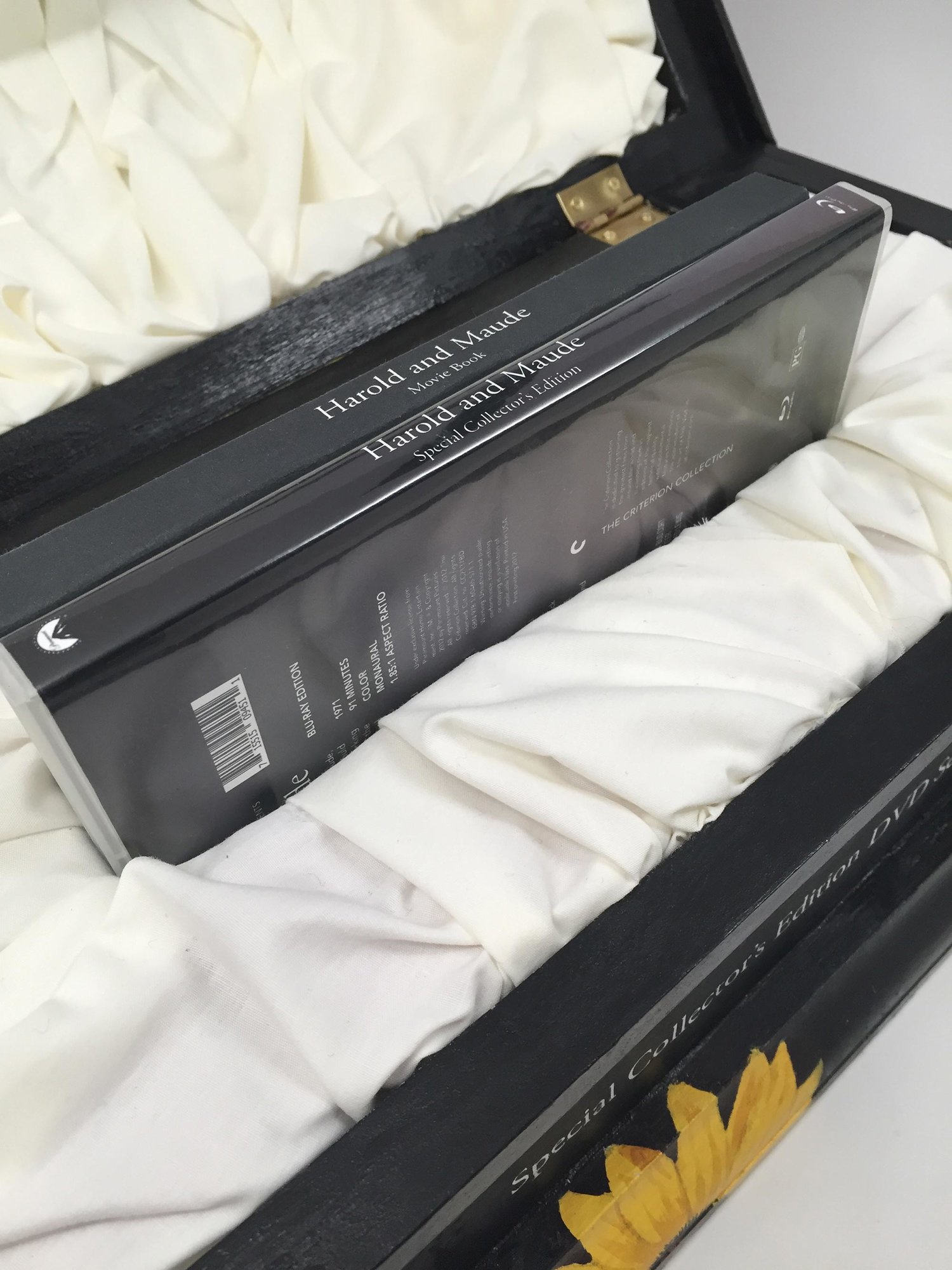
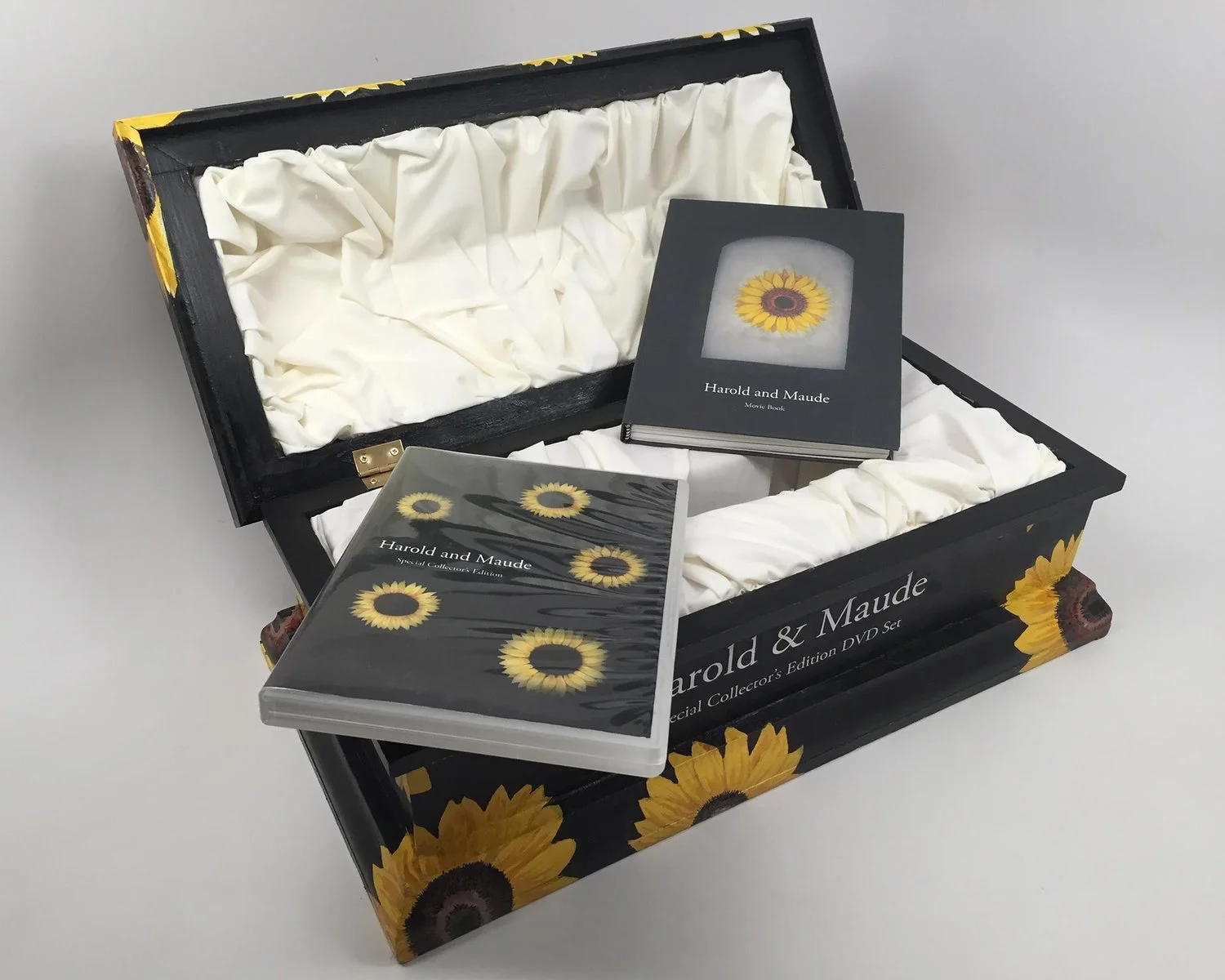
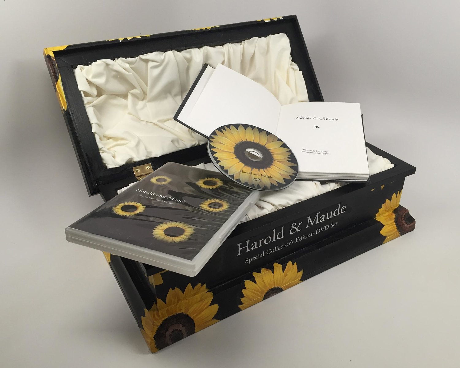
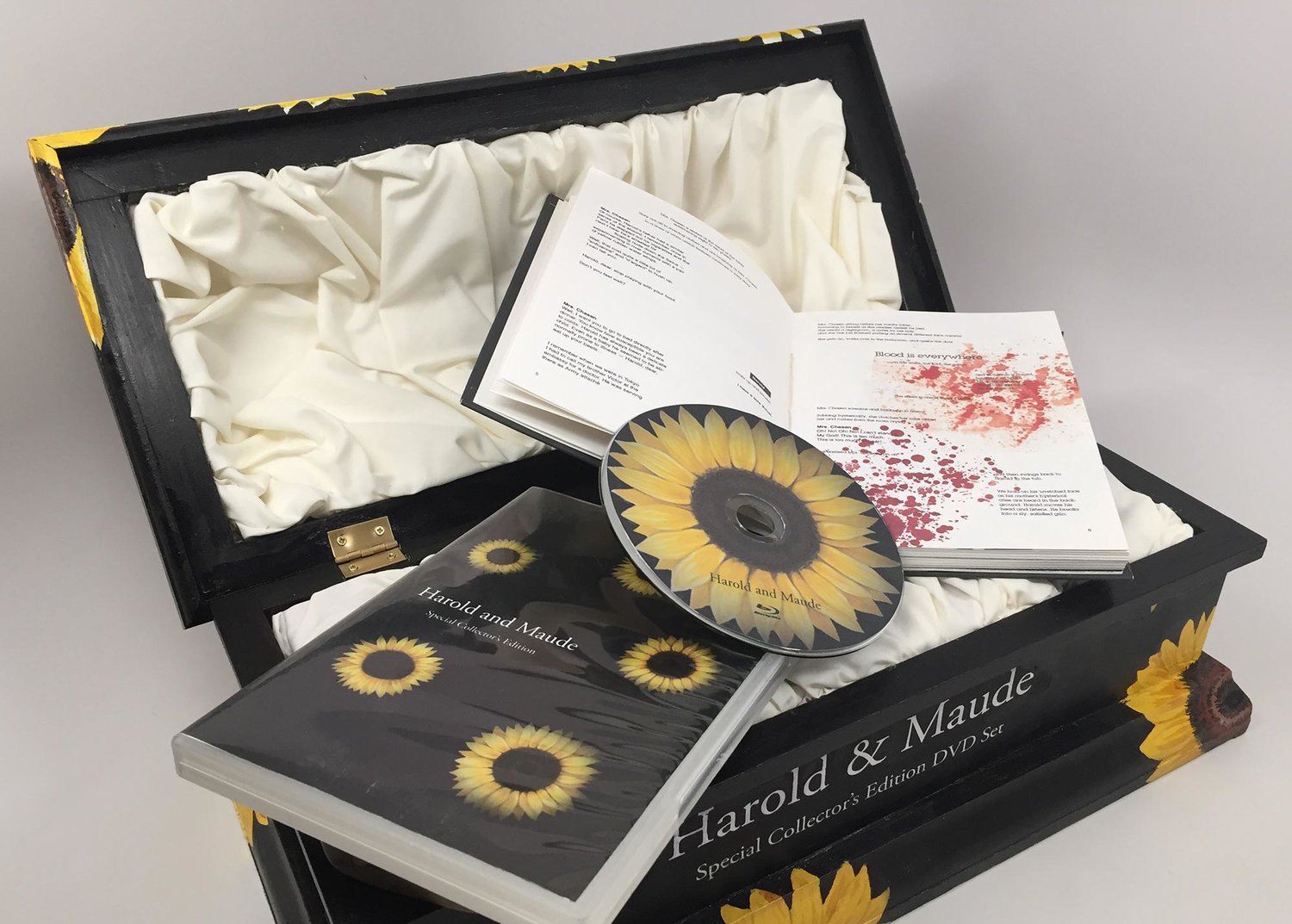
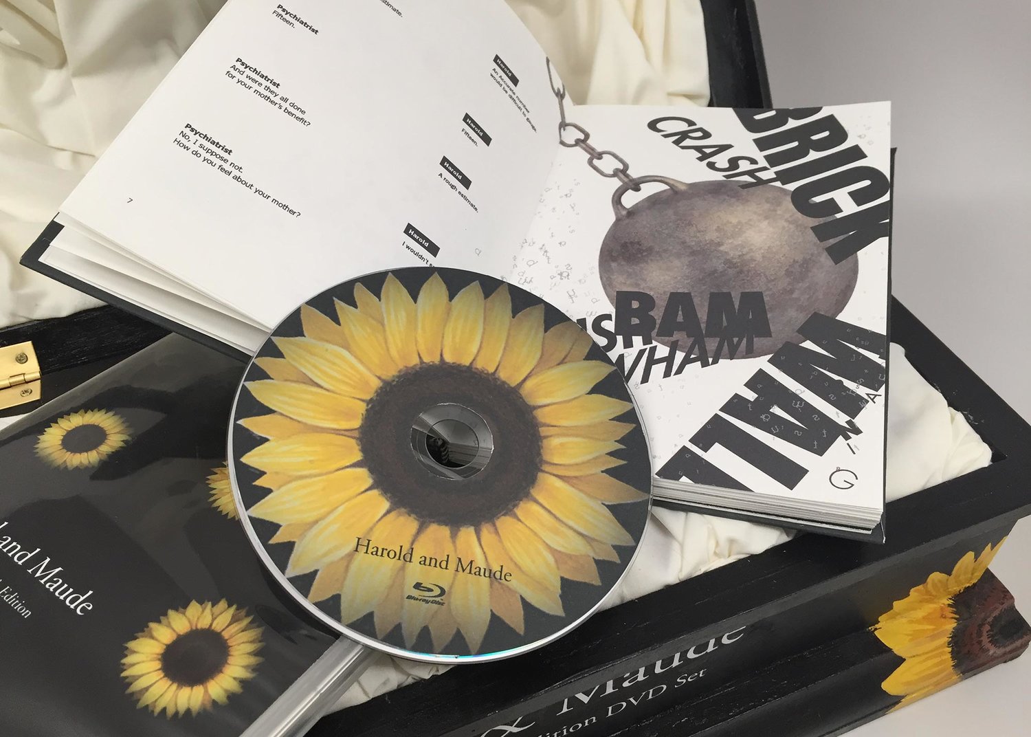
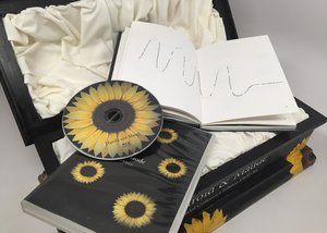
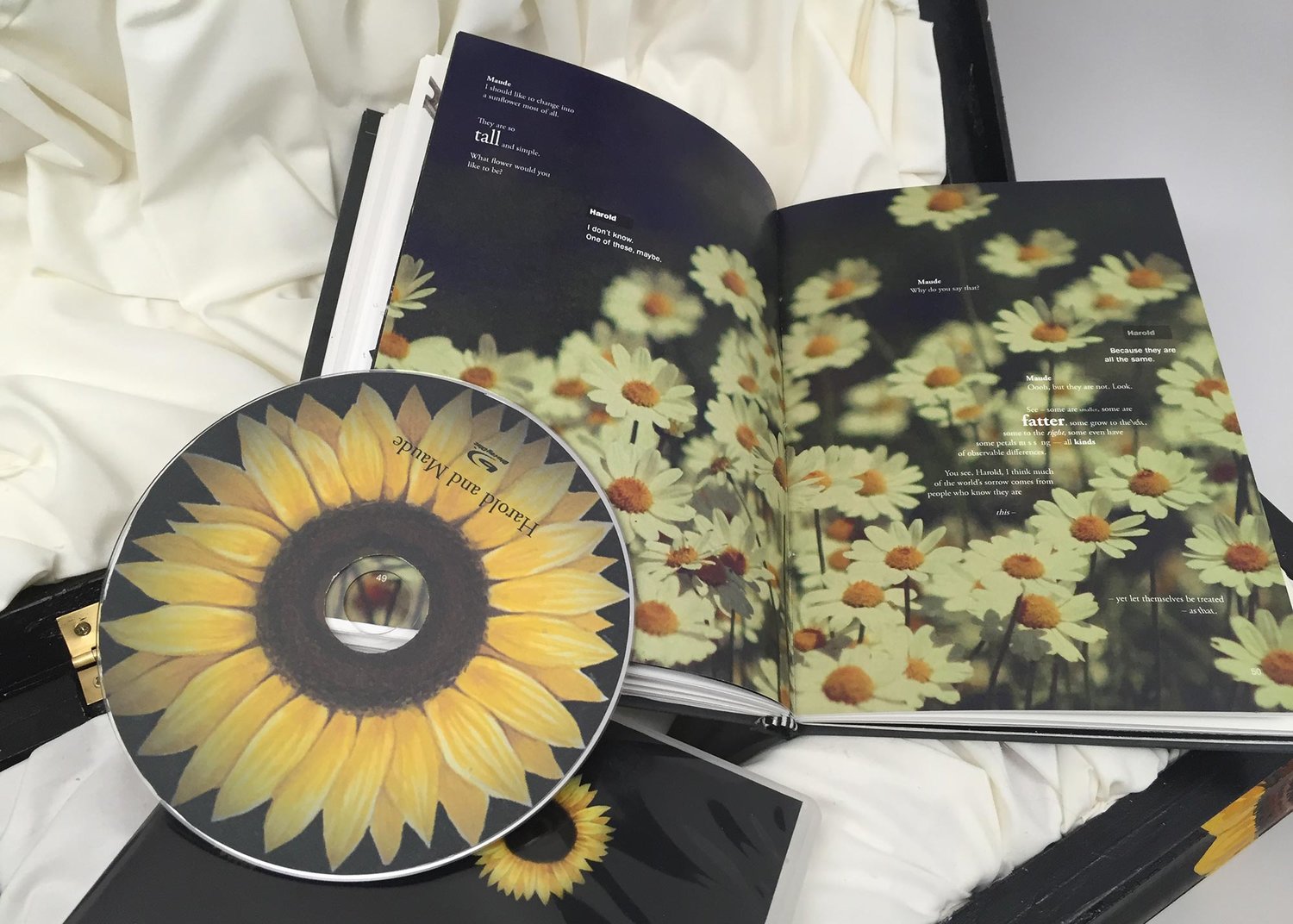
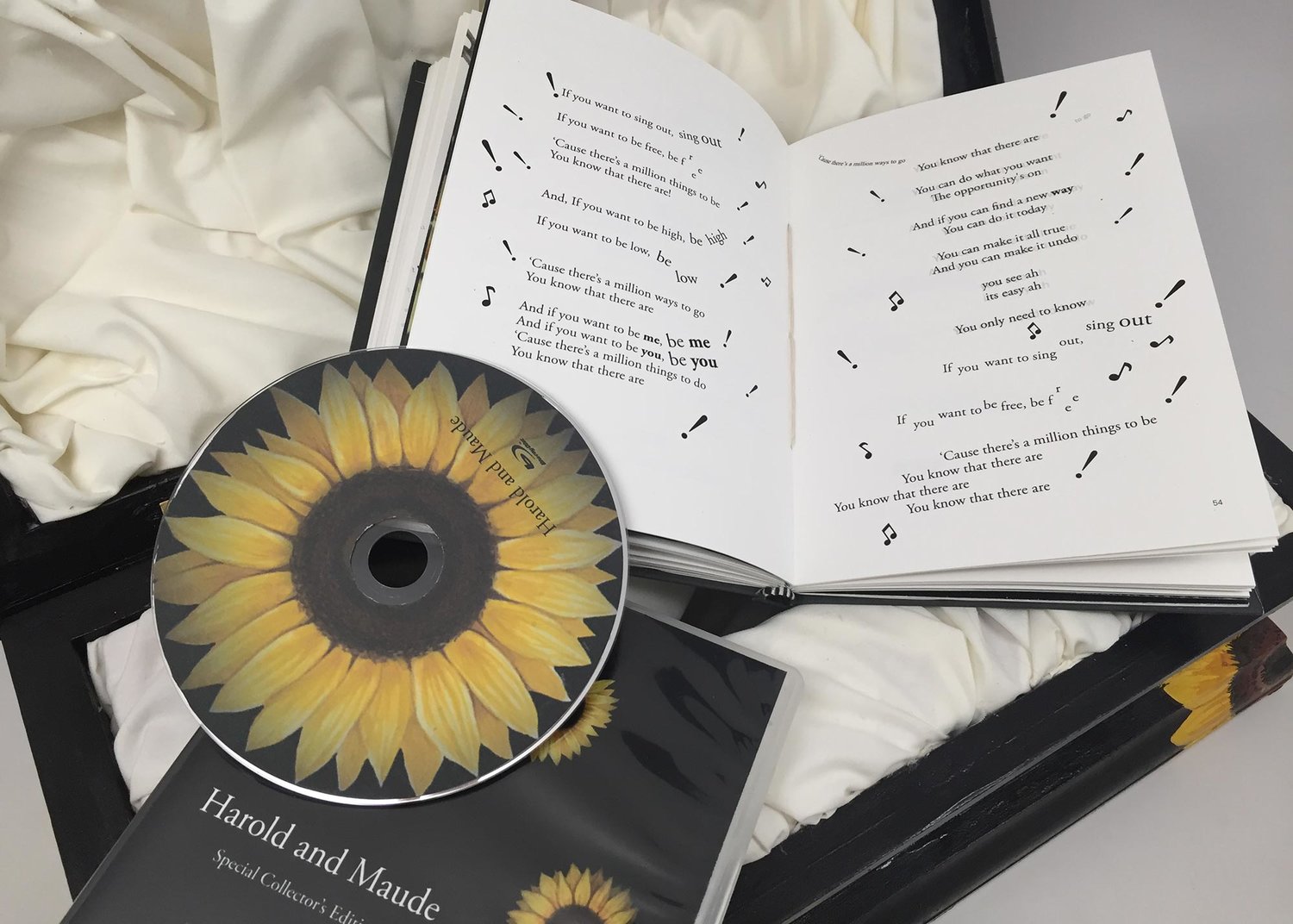
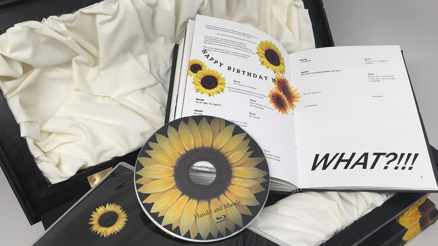
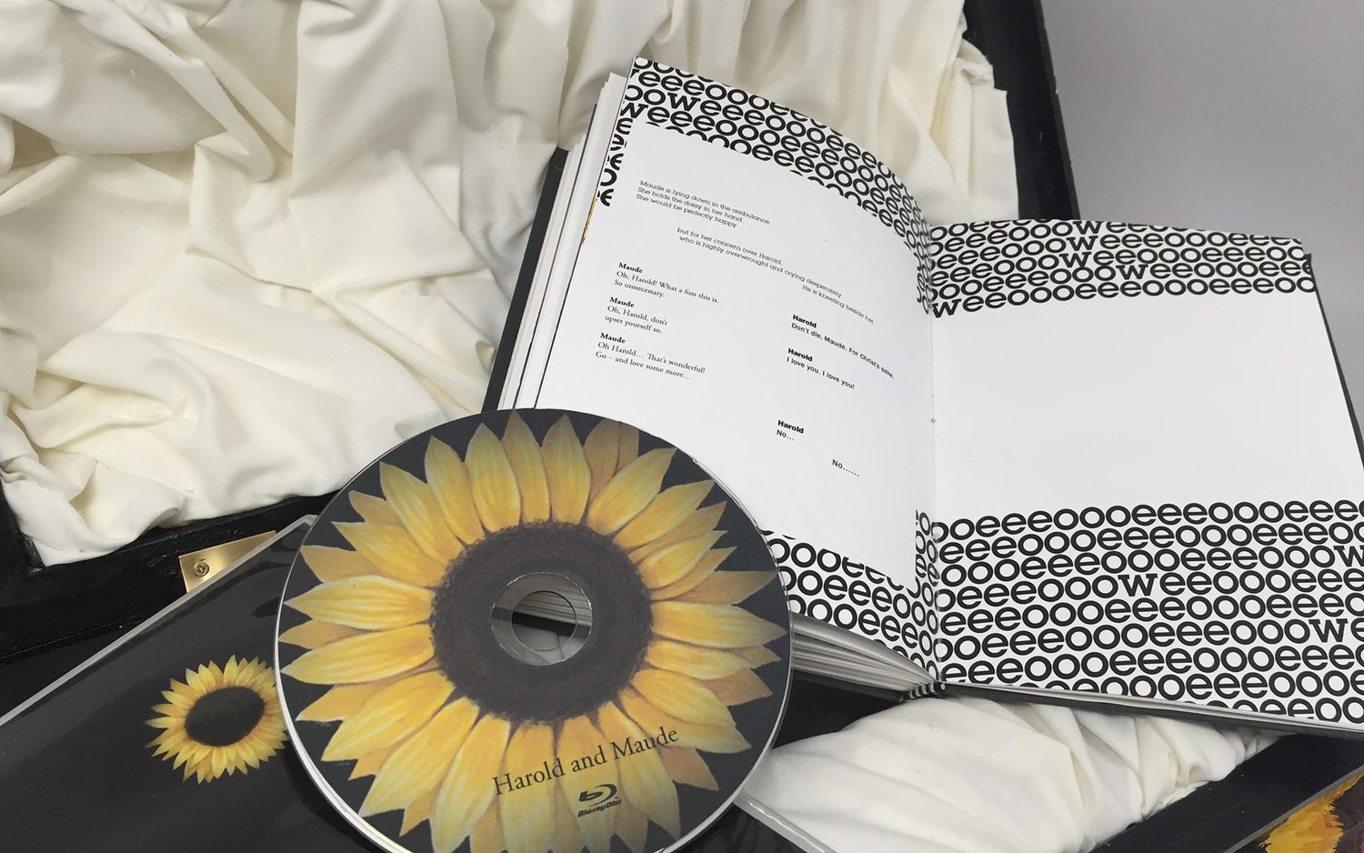
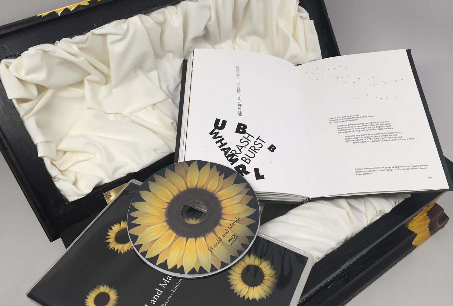
Harold and Maude: Collector's Edition DVD Set + Movie Book
Special collector's edition DVD set package design for Harold and Maude that visualizes how Maude's perspective on life and death is different from that of Harold's and how Harold's pessimistic approach to life gets positively changed as he meets Maude. Built the casket out of plywood, hand-painted the sunflowers on the exterior using acrylic, painted the sunflowers and other elements for the DVD and the movie book using watercolor. The movie book was hand-bound using the Coptic stitch.
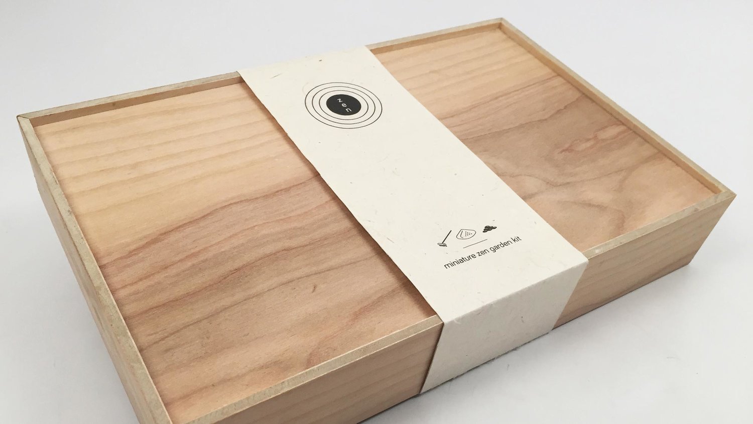
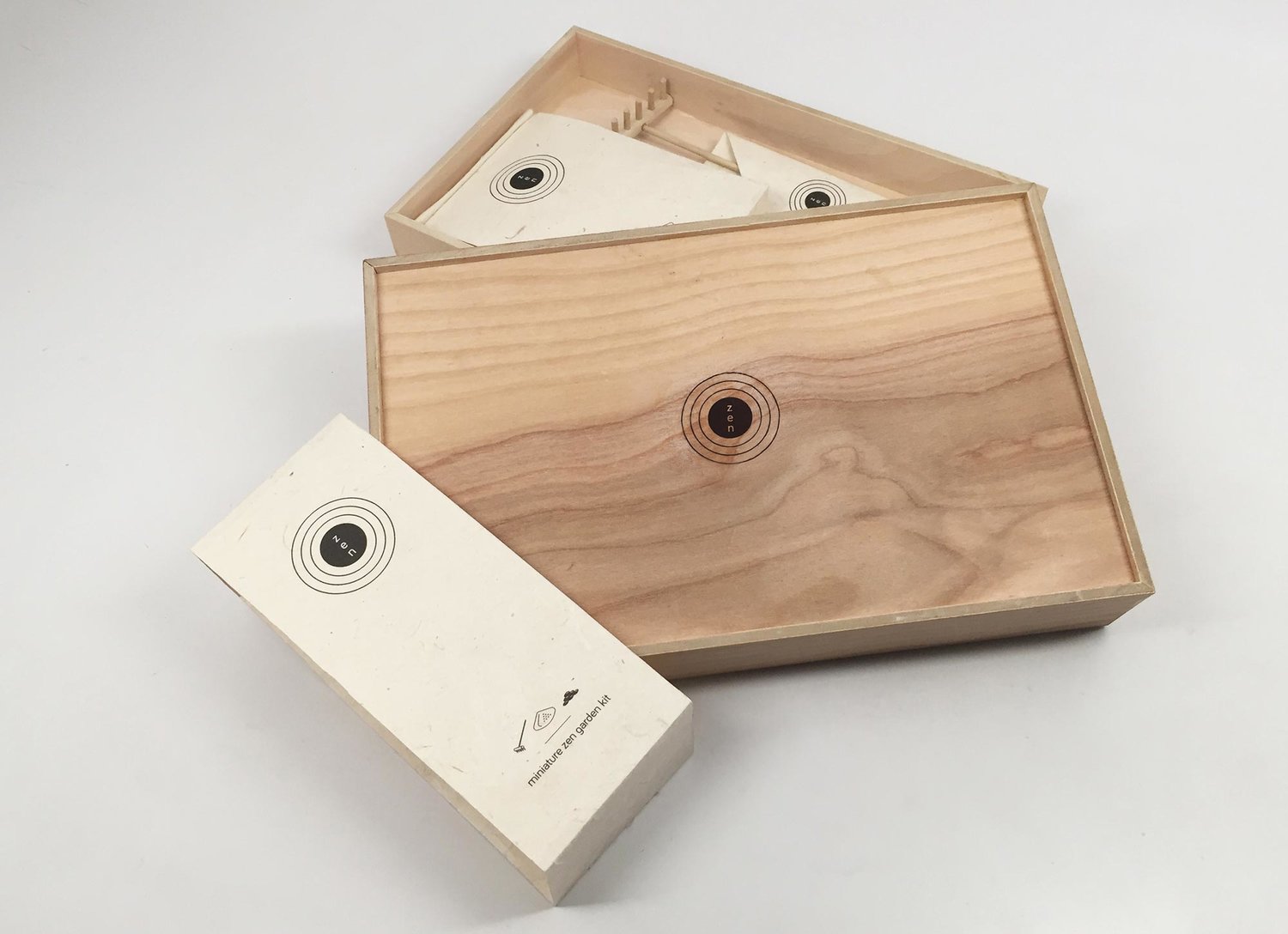
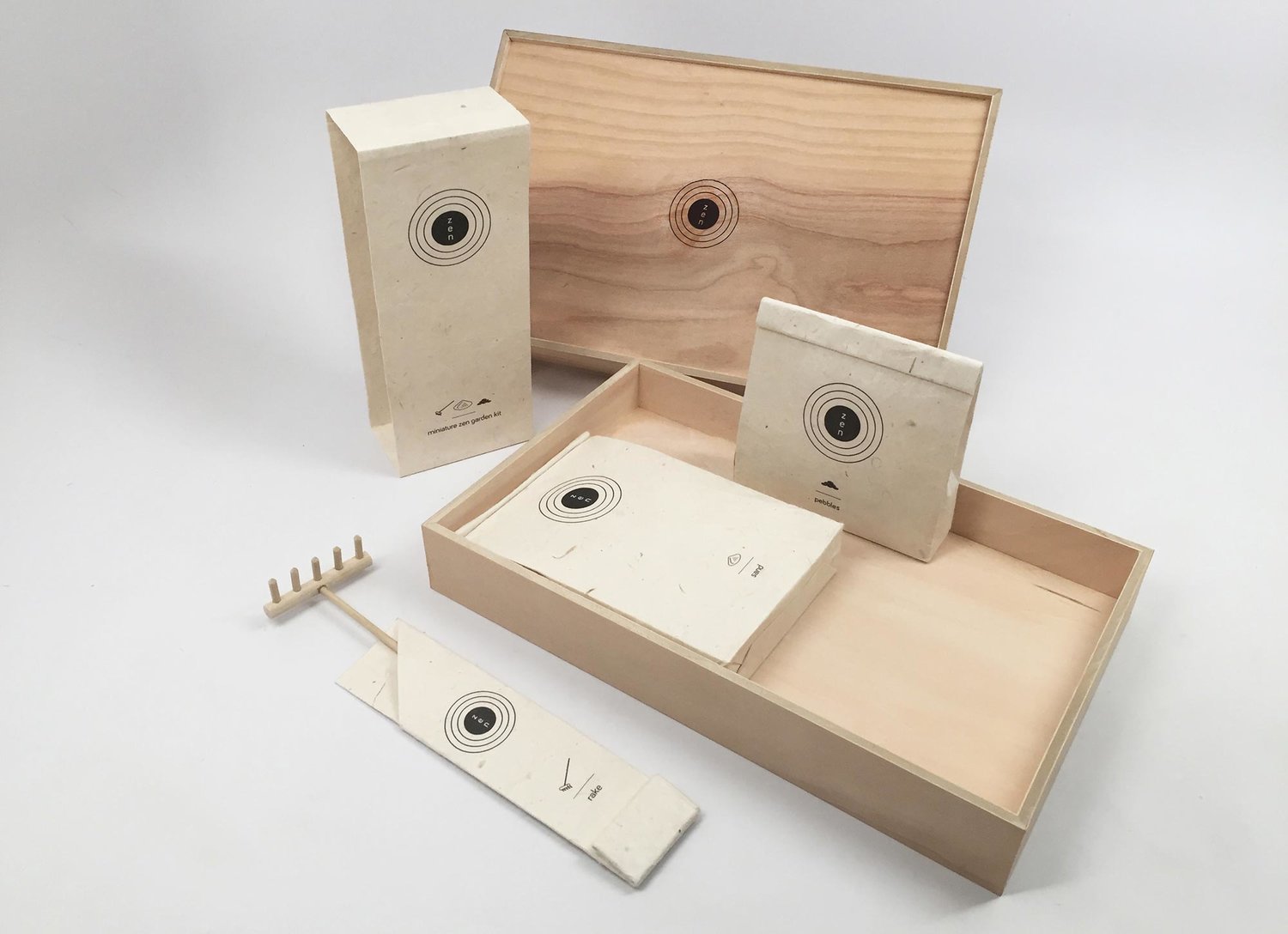
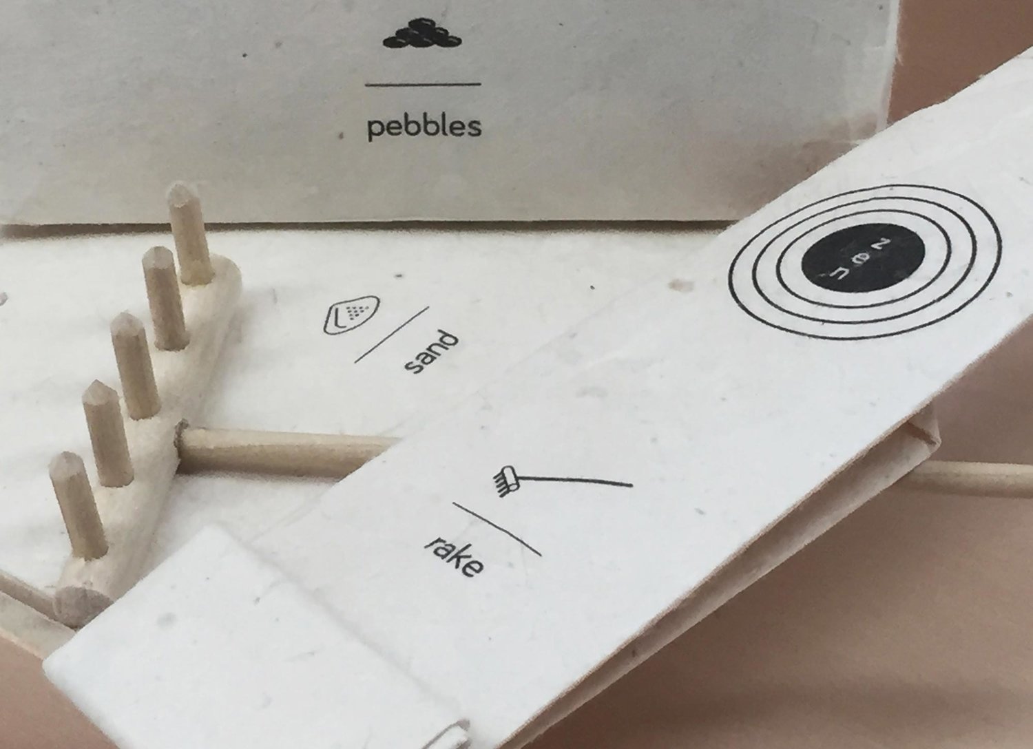
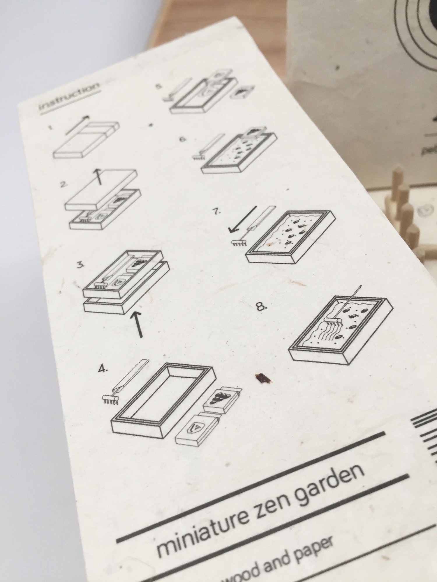
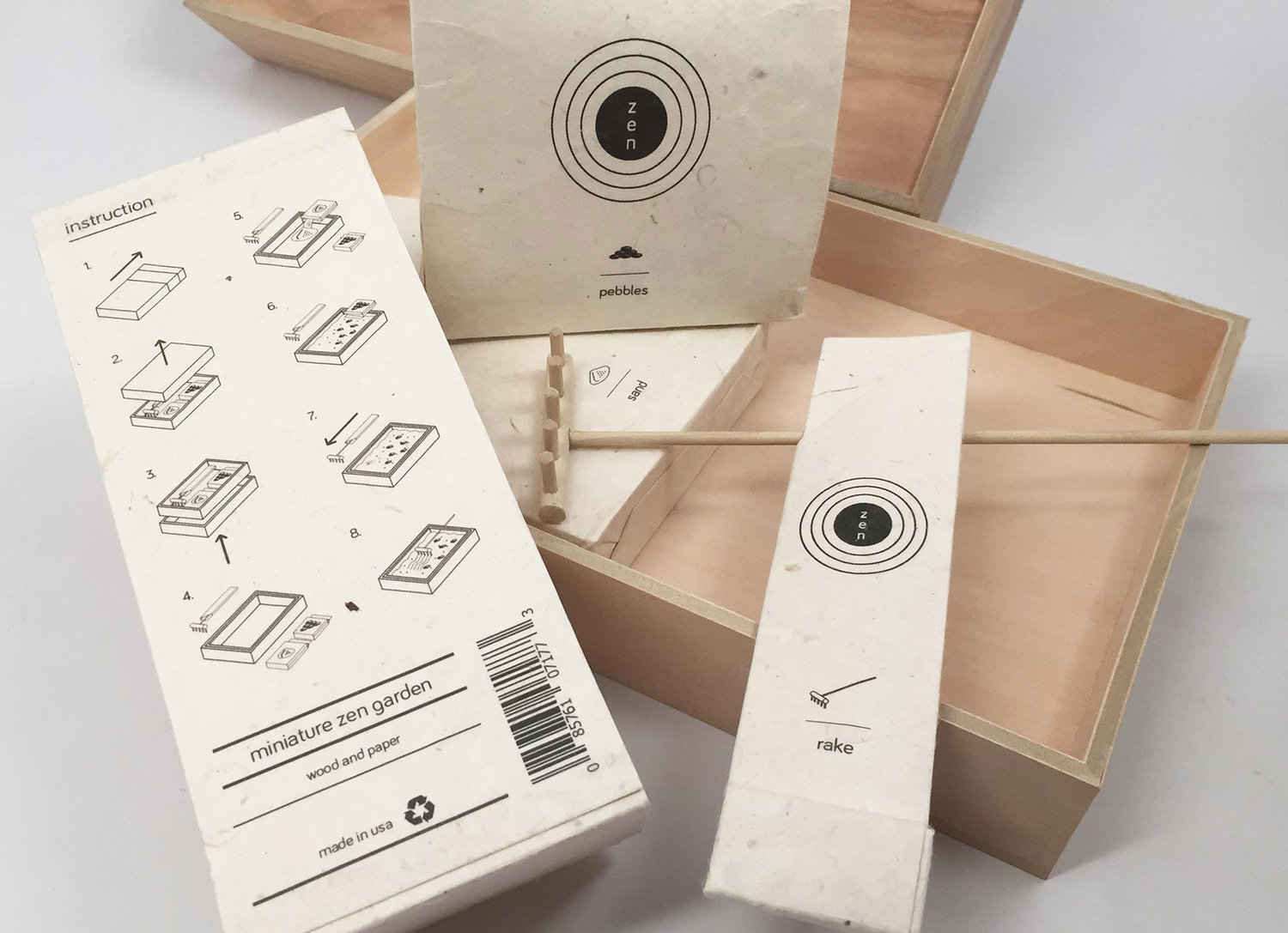
Miniature Zen Garden Kit
Package design for a toy that I played with when I was a child. When researching different kinds of zen garden kits, I noticed the current packagings for the mini zen garden kits uses plastic, which goes against the whole teaching of zen and its advocacy for a harmonious relationship with nature. The current packaging design does not provoke the zen feeling either. As a solution, I designed eco-friendly packaging to better communicate zen teachings, which is about peace and meditation. The box was created in a wood, and the wrapping was created in a special textured paper. I used minimalistic, isometric illustrations for the content and instructions on how to use the zen garden kit. That way, the kit could communicate its content and the instructions with less visual noise.