

Willie’s Superbrew
When Farmer Willie's started their business in 2014, they were simply a ginger beer company. In 2017, they contacted Center to create new brand identity and packaging that would reflect their new business direction, changing their product line from simple ginger beer to what they call "superbrew" which means superfoods (such as pomegranate, açai, etc) + fermentation. It's not beer, or cider, or seltzer. And it's not just about ginger. It's something completely different, so they thought borrowing another name didn't feel right.
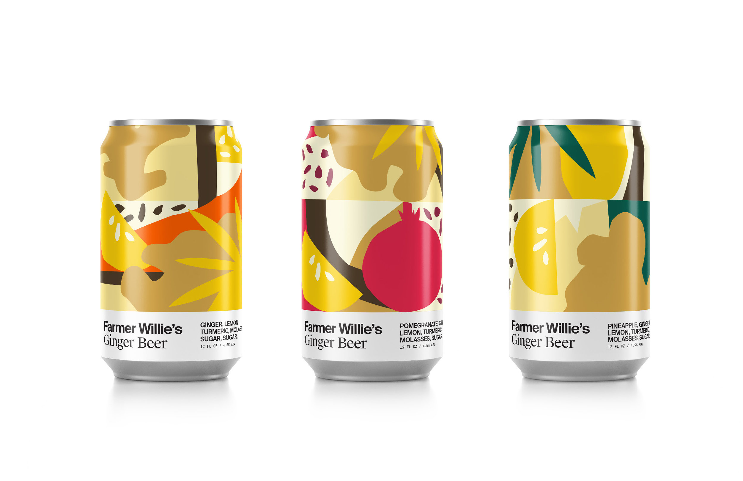
I joined Center for the second round of explorations. Since Center's first exploration was mostly focused on utilization of vector illustration, scientific illustration, or type focused, I wanted to suggest a direction which uses organic illustration of the ingredients using bold colors as accents.


Final Outcome
Overall, Center wanted to create something outside the can that represents what's inside. With vibrant colors, clean yet natural lines, and a collision of fruit and flavor, the new can art looks how the drink feels.

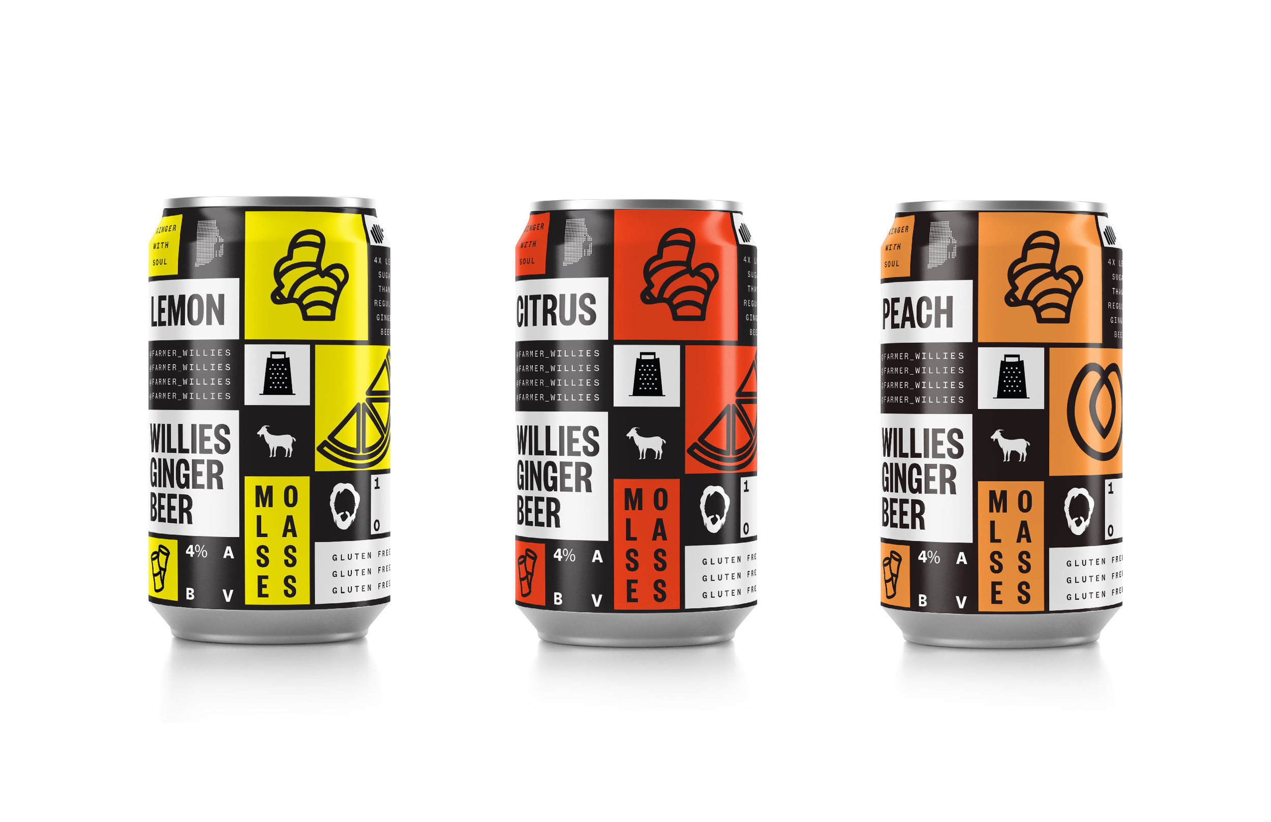
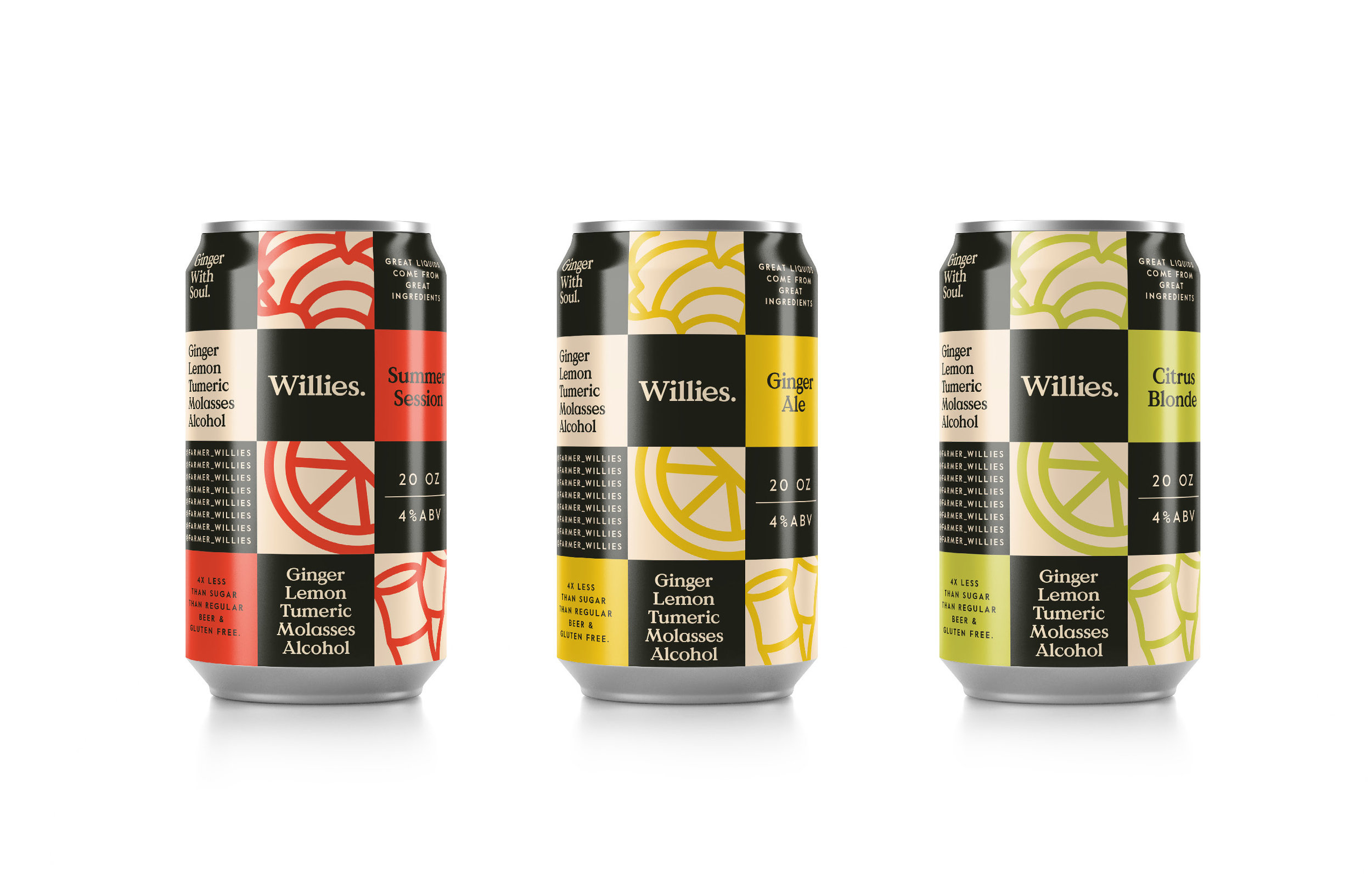
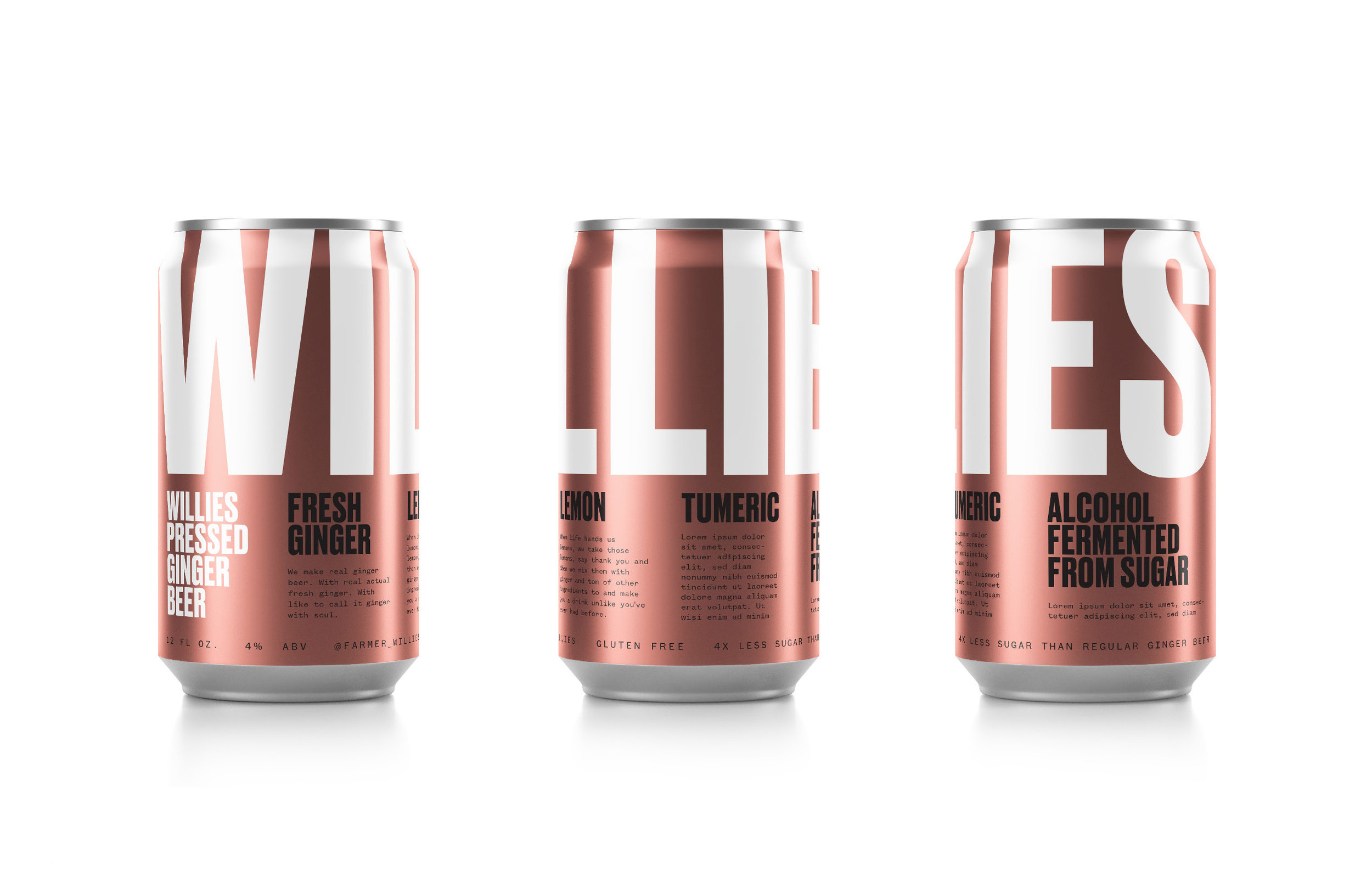
Misc 01
First round of explorations by Alex Center & another freelance designer at Center


Misc 02
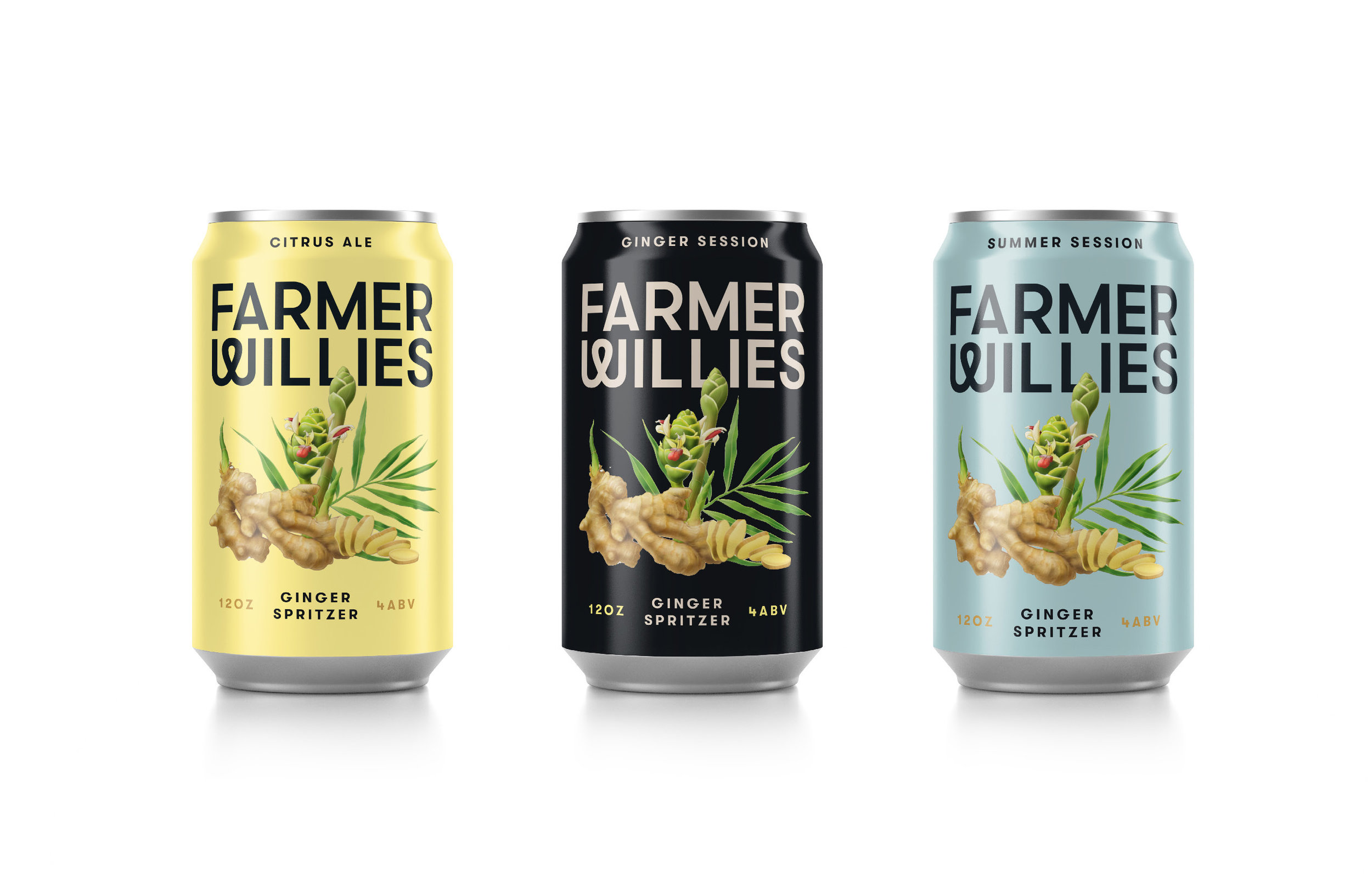
Farmer Willie's original ginger beer branding and packaging (2014).
